Turbo Timer
A round smart display, and the fleet admin that runs it. One UI system across four devices and three screen geometries, designed for the circle rather than cropped into it.
Turbo Timer is a smart display built on a circular LCD. It runs a full-screen kiosk UI with seventeen mini apps and a set of swappable watchfaces, on a small fleet of Raspberry Pi devices that do not share a screen shape. I designed and built the whole thing: the round UI grammar, the watchface system, the hardware form, and the admin that configures every device in the fleet. The codebase is called SuperClock.
Everything below is either a real render from the shipped kiosk or a wireframe plate from the working boards. Nothing here is a mockup made for the case study.
- 2026, ongoing
- Sole designer and developer
- Personal product, hardware and software
- Round kiosk UI, fleet admin
- 4 Raspberry Pi devices, 3 screen geometries
- React 19, TypeScript, Vite, Tailwind v4
The constraint
The fleet is four devices and only three of them agree on anything. A Pi 5 drives a 5 inch 1080 by 1080 round panel. A Pi 4 drives a 3.4 inch 800 by 800 round panel. Another Pi 4 drives a 5 inch 800 by 480 rectangle. A Pi Zero 2 W drives a second 1080 by 1080 round panel on roughly a tenth of the compute.
There is no responsive system here, and I want to be precise about that. The UI is laid out for 1080 by 1080. The smaller round device scales that layout down. The rectangular device fits it to the short edge. That decision is the interesting part of this project, because it is a real trade rather than a clean win.
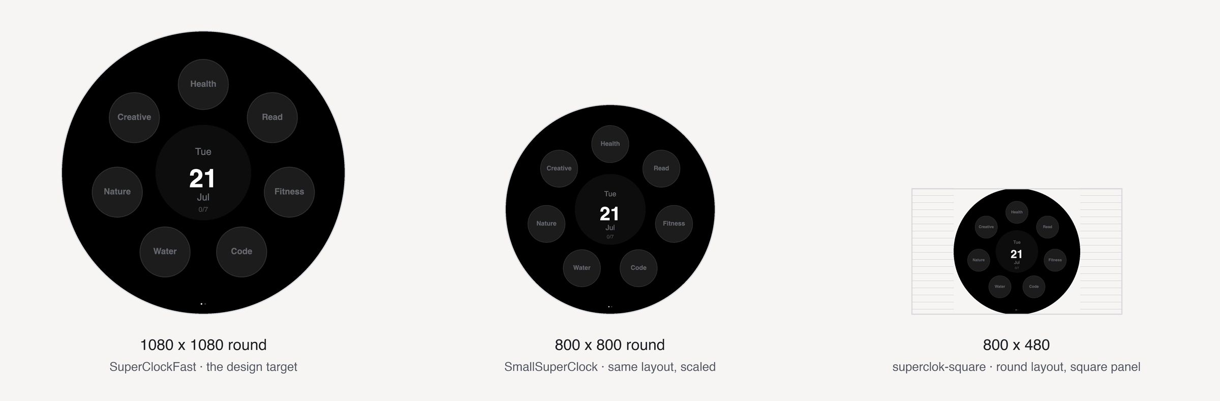
Round-native, not a masked rectangle
The easy version of this product is a rectangular dashboard with a circular mask over it. It looks fine in a render and it wastes the only thing that makes a round display interesting, which is that the rim is addressable and the corners do not exist.
So the navigation grammar is polar. Touch is classified by angle from twelve o’clock, and an outer ring is split into ninety degree arcs at twelve, six and nine. The ring width is expressed as a fraction of the disc radius rather than a pixel constant, so it survives the change in panel size. The three o’clock arc is deliberately unassigned and falls through to the inner behaviour, because a fourth gesture was one more than the product needed.
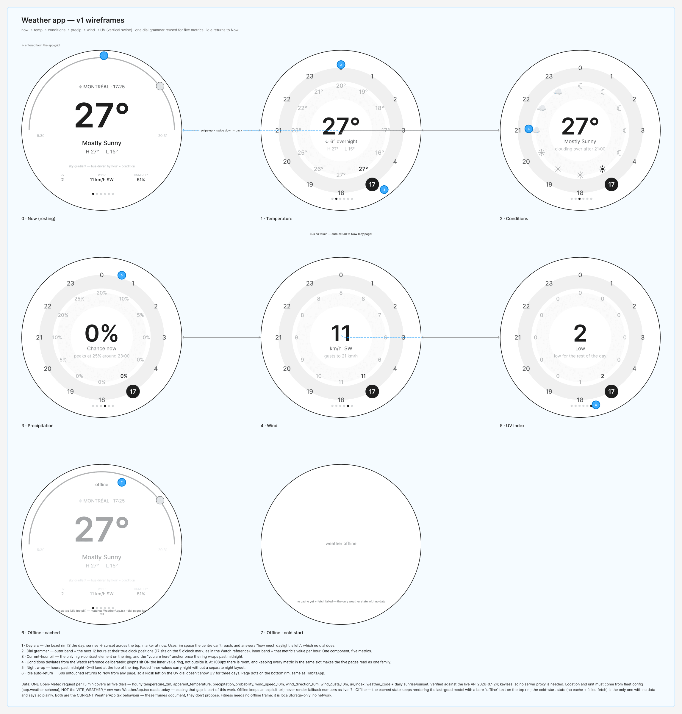
The same thinking runs through the apps. Weather puts the day on the bezel: sunrise to sunset across the top with a marker at now, using rim space the centre cannot reach and answering a question no dial answers. The hour ring places each hour at its true clock position, so seventeen sits on the five o’clock mark. One dial component then carries five different metrics, which is what makes the five pages read as one family instead of five screens.
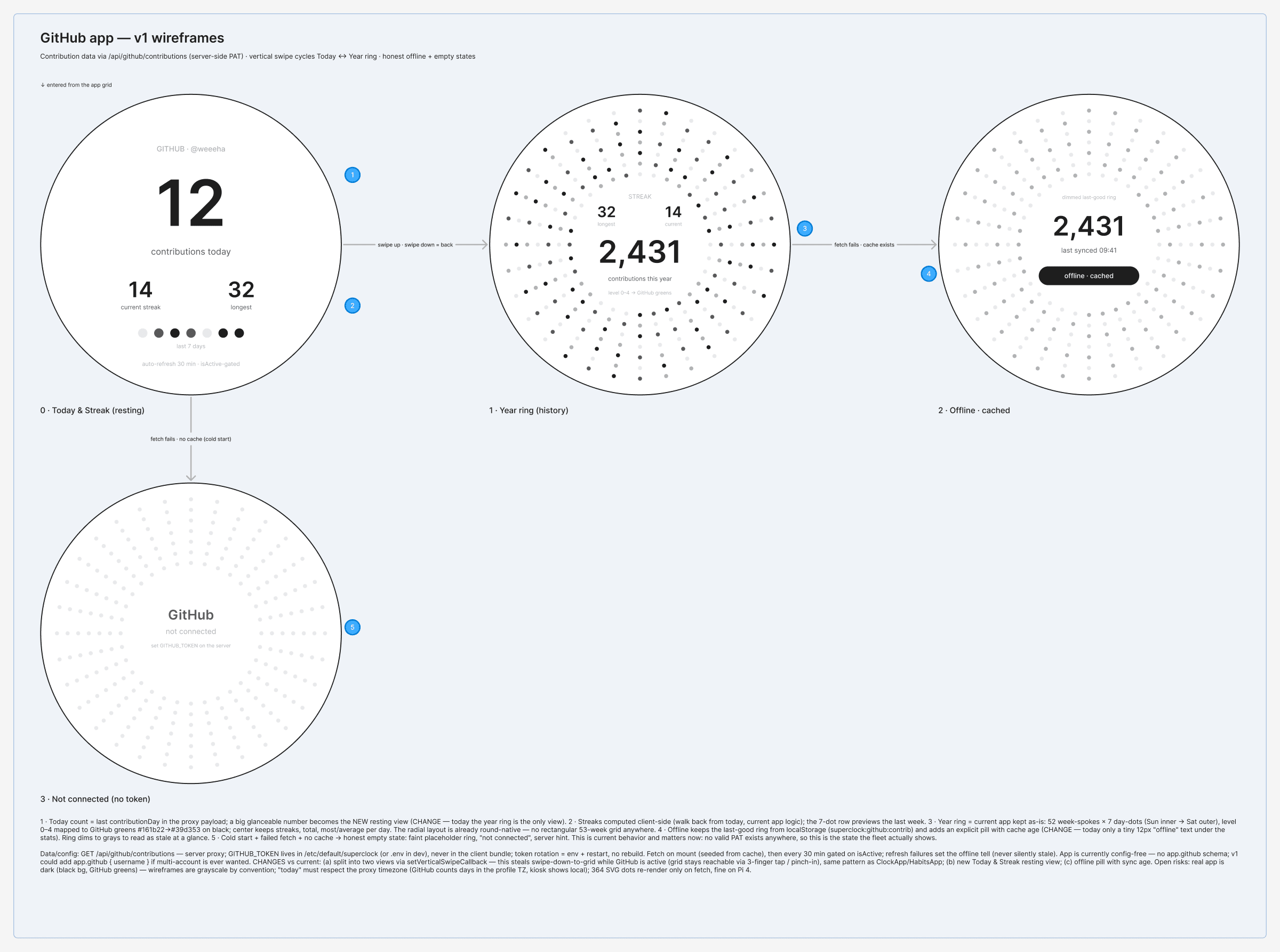
GitHub was the clearest case of the constraint paying off. The contribution graph everyone knows is a 53 week rectangle. On a circle it becomes 52 week spokes of seven day dots, Sunday inner to Saturday outer, with streaks and totals in the middle. It is not a compromise version of the rectangular grid, it is a better fit for the surface, and there is no rectangular grid anywhere in the app.
Faces as a system
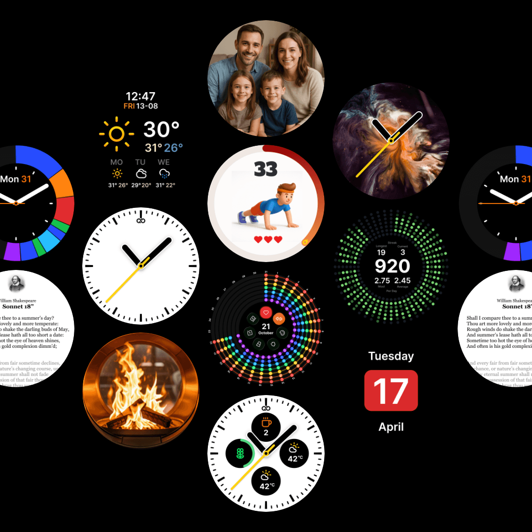
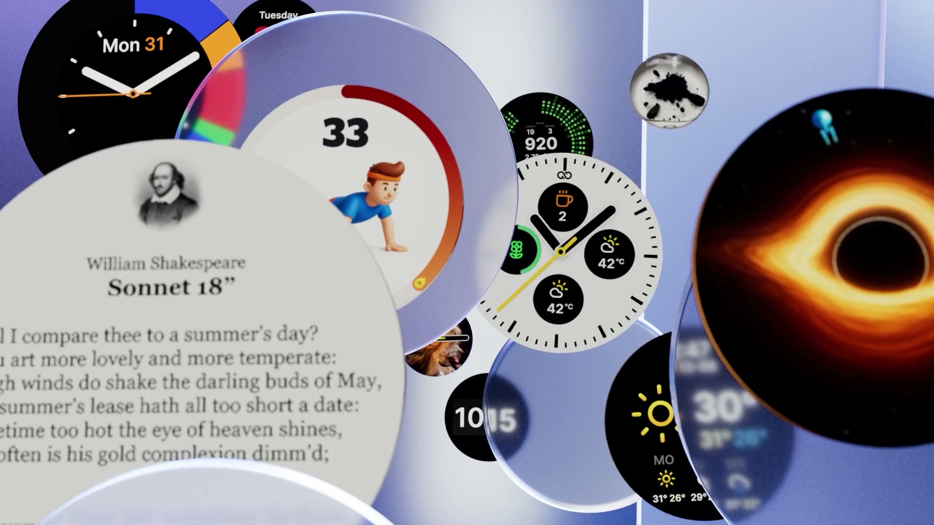
A watchface here is a component with a descriptor, not a picture. Each face registers in a registry, declares a schema for its own options, and reads its colours from face level tokens so night mode inverts the whole set without per-face work. Thirteen faces sit in the swipe cycle. Pinning a face in fleet config disables cycling, which is what you want on a wall mounted device.
One detail I am fond of, because it is the kind of thing that only shows up once you own the hardware: the slowest device cannot run the browser face acceptably, so its primary face has a hand written native twin. That created a parity rule. Any change to the geometry or palette of the React face has to land in the native twin in the same change, or be filed as a follow up.
Honest states
A device that sits on a shelf all day is a liar by default. If a feed dies at 3am, a dashboard that keeps rendering yesterday’s numbers looks exactly like a dashboard that works. So the rule across both surfaces is that nothing renders fallback data as live, and every degraded condition gets its own tell rather than a generic error.
That means separating states most products collapse together. Cached but stale is not the same as cold start with no cache, which is not the same as never configured. Each one says something different and each one is designed.
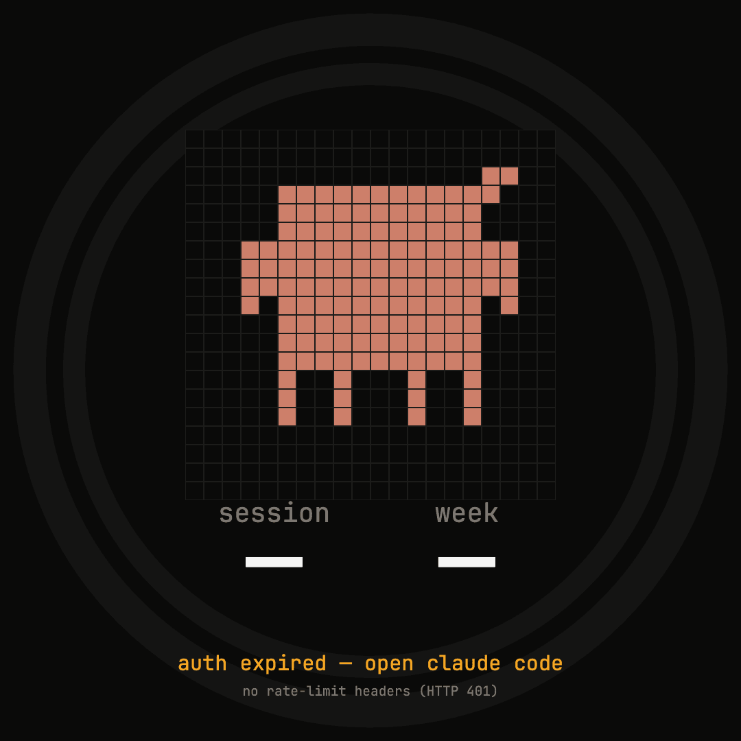
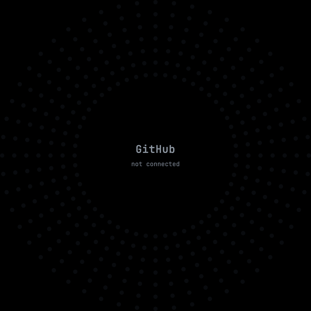
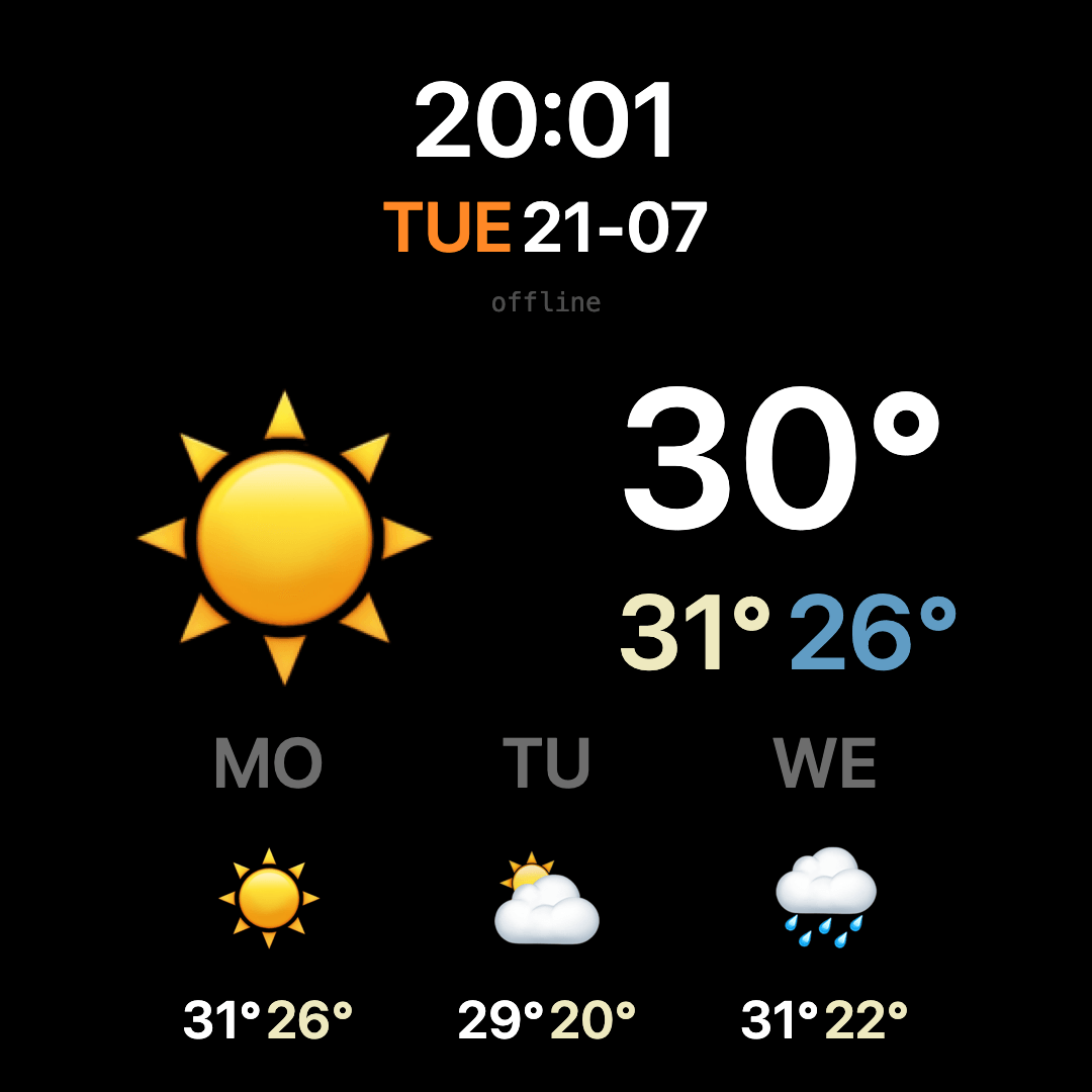
These are the states the fleet genuinely shows today, captured as they are. Designing them properly is unglamorous and it is most of what separates a device you trust from one you stop looking at.
The admin that runs the fleet
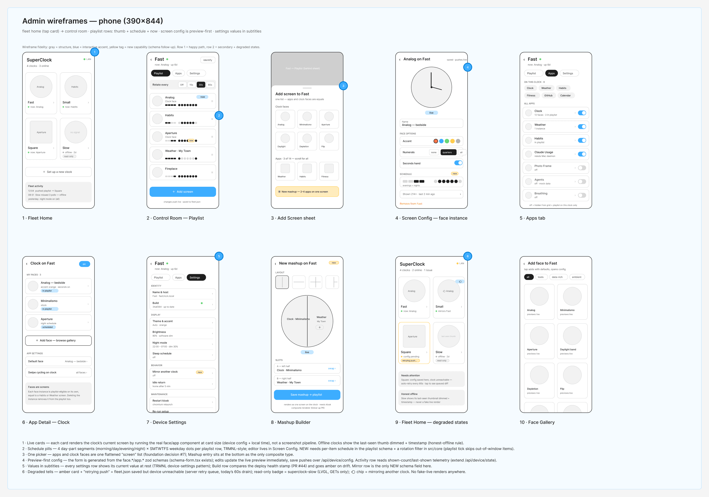
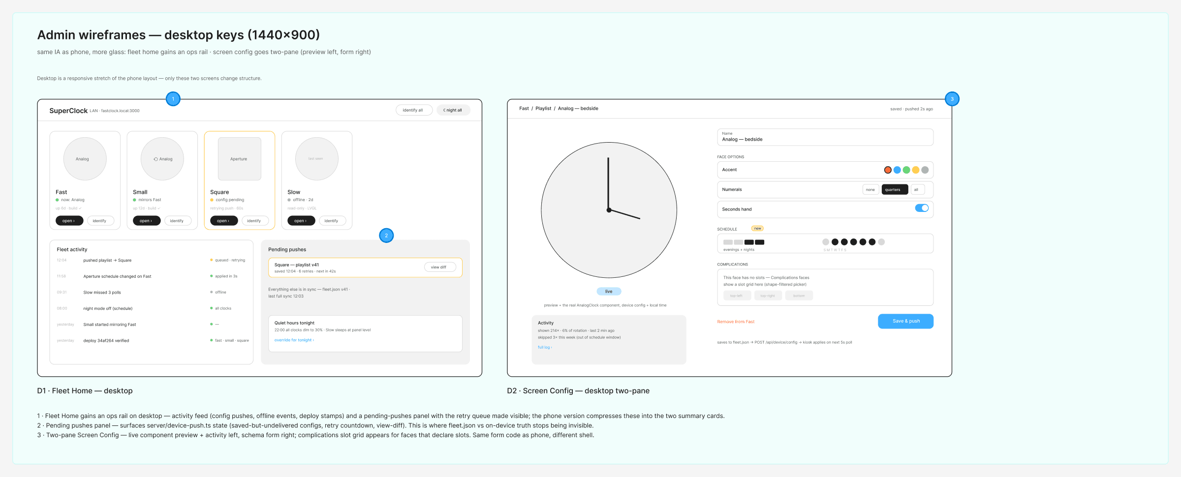
The second surface is the opposite of the first: rectangular, phone first, dense with text. I reviewed TRMNL’s plugin ecosystem before designing it, and took one deliberate departure. Their admin has a global device switcher in the corner, which invites the wrong-device error where you edit the wrong screen without noticing. Here the home is the shelf. All four clocks with live thumbnails and health, and scope comes from tapping into a device rather than from a dropdown you might have forgotten.
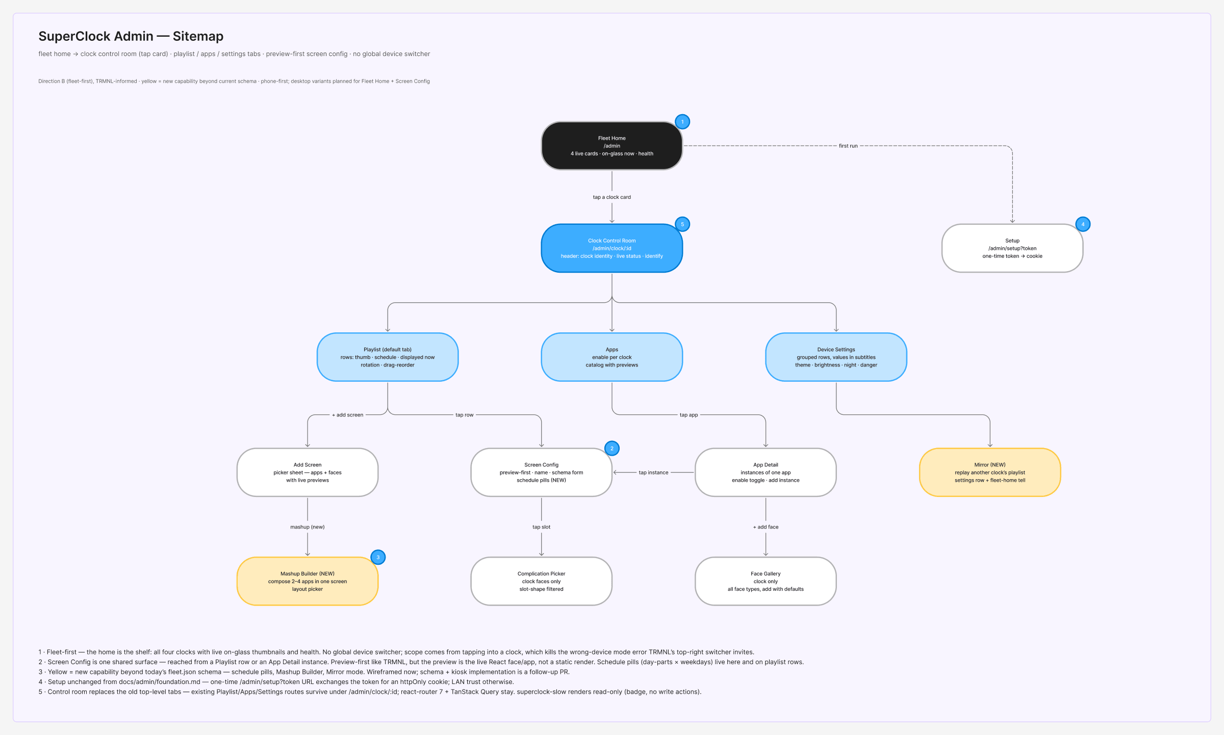
Two decisions carry the rest of it. First, the preview is the real component. Cards and config previews run the actual face at card size against the device config and local time, rather than serving a screenshot, so what you see is what the device does. Second, the settings form is generated from the same schemas the kiosk validates against, which means a new app arrives with a settings UI already built.
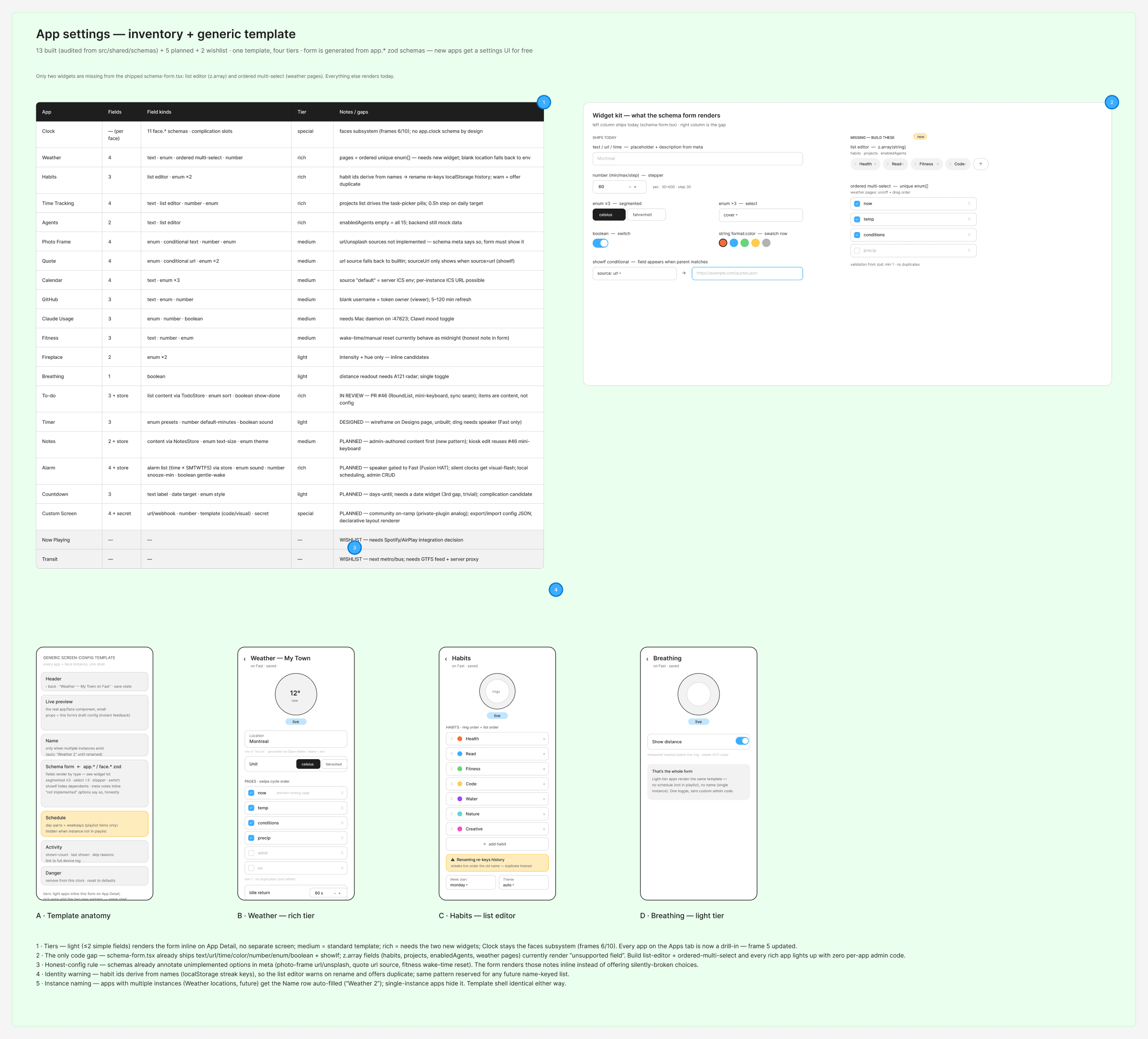
Because the form is schema driven, the design work stopped being screen design and became an inventory question: which input widgets does the schema language actually need, and which of those already exist. The answer was that everything rendered except two things, a list editor and an ordered multi-select. A gap that specific is a build ticket rather than a redesign.
The object
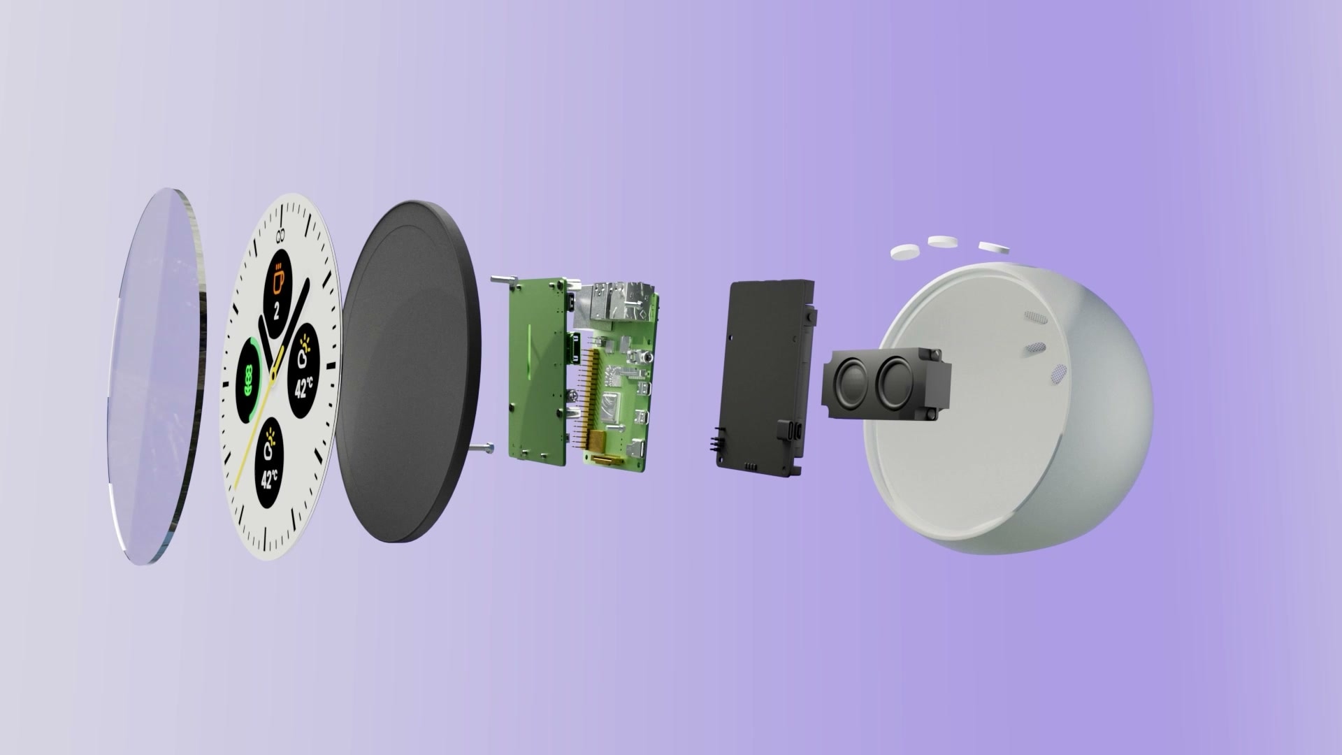
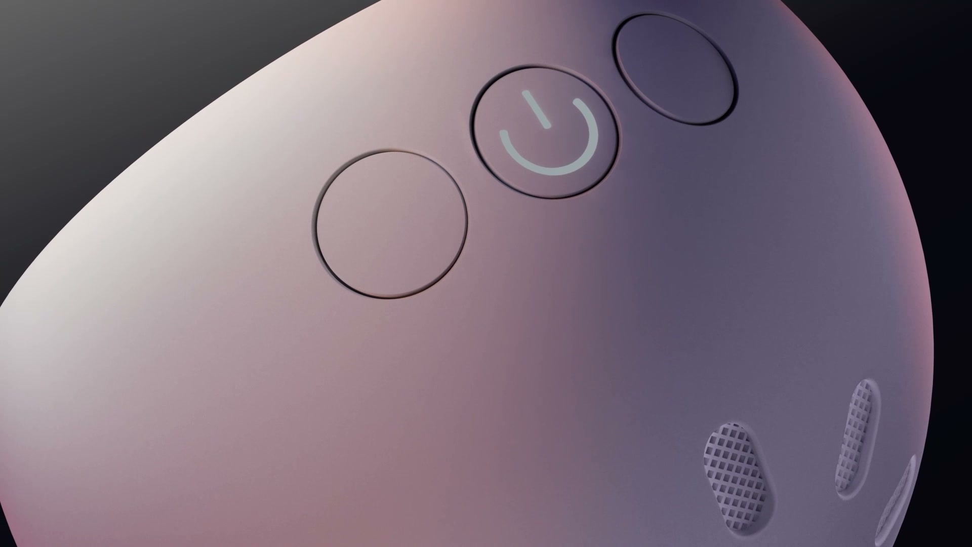
The enclosure follows the same logic as the UI. A circular screen behind a lens, a body with enough depth for a speaker and a battery, and physical controls placed where a hand lands when it reaches for a clock rather than a tablet.
How it was built
Every app in the boards above was specified before it was built, with the data contract, the config schema and the open risks written next to the frames. Each frame is labelled as either current behaviour or a proposal, so the boards stay honest about what exists. Geometry is unit tested, the registries are pinned against each other so drift fails the build rather than shipping, and deploys are verified against a build stamp on the device instead of assumed.
None of that is design work in the narrow sense. All of it is why a four device fleet with three screen shapes stays coherent instead of turning into four slightly different products.
That half of the project has its own case study: How Turbo Timer is built, with the face contracts, the native parity check and the gates that keep the fleet on-design.
Reflection
What I would do differently. Design the rectangular device first, or decide honestly not to support it. Fitting a round-first grammar to an 800 by 480 panel leaves real estate unusable and gives that device a second-class version of the product. Committing to the circle was right; letting a rectangle join the fleet afterwards was the loose end.
What surprised me. How much of the design work turned out to be state design rather than layout. The layouts settled quickly because the circle constrains them. The time went into offline, stale, cold start and never-configured, which is also where the product earns or loses trust.
What I would keep. Generating the admin form from the same schema the device validates against. It collapsed a whole category of design work into a widget inventory, and it means the eighteenth app costs no admin design at all.