LifeOS is an independent personal life-management system I’m designing and building. It brings task capture, a journal, check-ins, and conversations with specialist agents into a native iPhone app, backed by a Python service on my Mac.
I own the product concept, interaction design, visual language, and implementation direction, and use AI coding tools throughout development. The project is an ongoing working prototype for my own use.
From a broad concept to a usable first loop
An earlier project, Life Atlas, depended on manually maintaining a picture of my life. LifeOS explores whether lightweight capture and agent assistance can make that picture easier to maintain.
Life Atlas
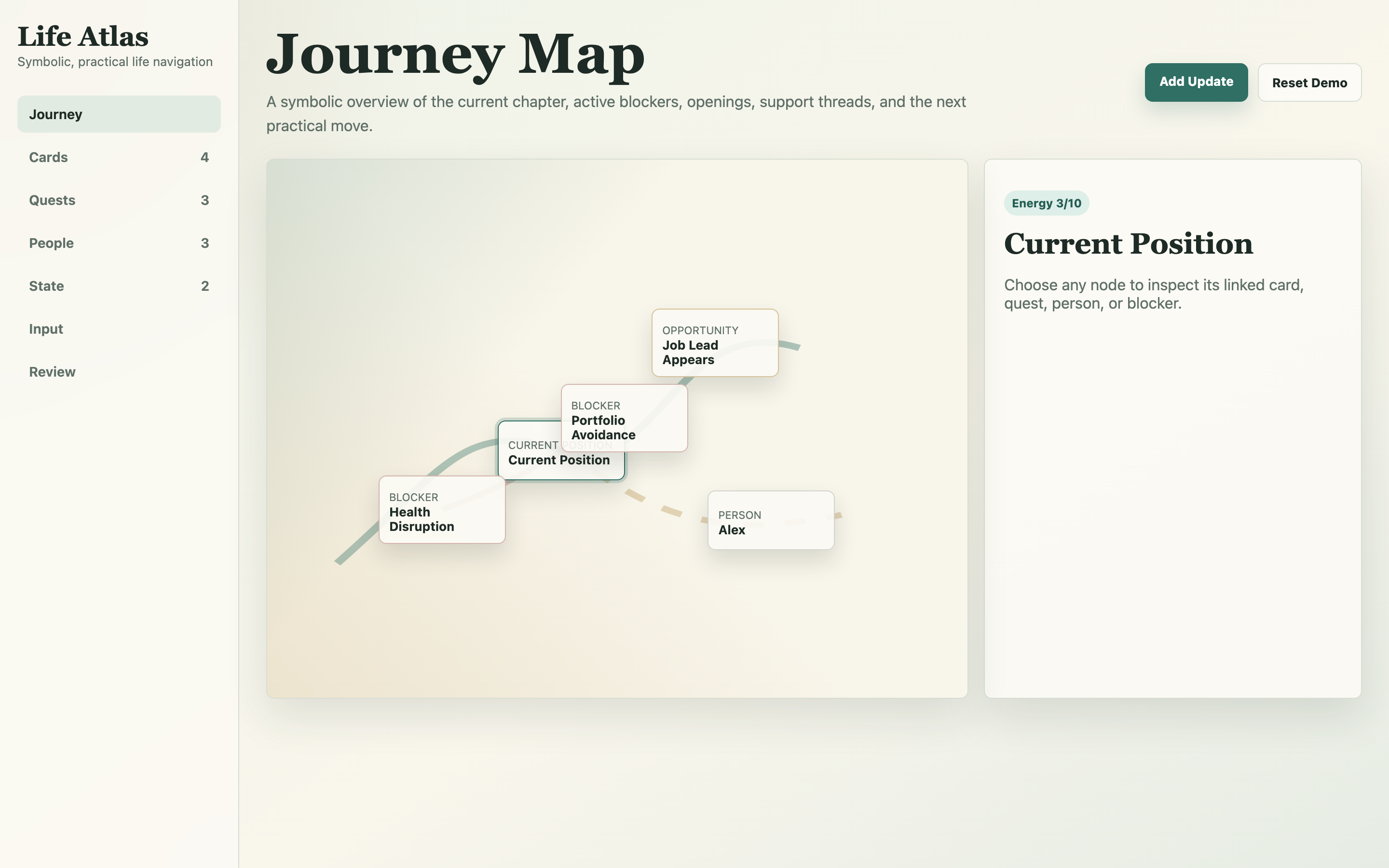
Life Atlas, the earlier web MVP, shown with its demo data. Its picture of a life, energy score included, came from updates entered by hand. Open Life Atlas.
The concept includes areas of life, people, skills, projects, and a larger game layer. For the Tasks slice, I focused on a smaller loop: capture a task, find it, complete it, and undo a mistake.
Signal
Event
Card
Vital effects
Quests
Growth
Avatar and journey
Weekly review
A life as a small economy
The first loop
I mapped the broader product around five main destinations, with capture available from every tab and personal progress behind the profile. The map made the relationship between everyday actions and the larger life model visible.
Product sitemap
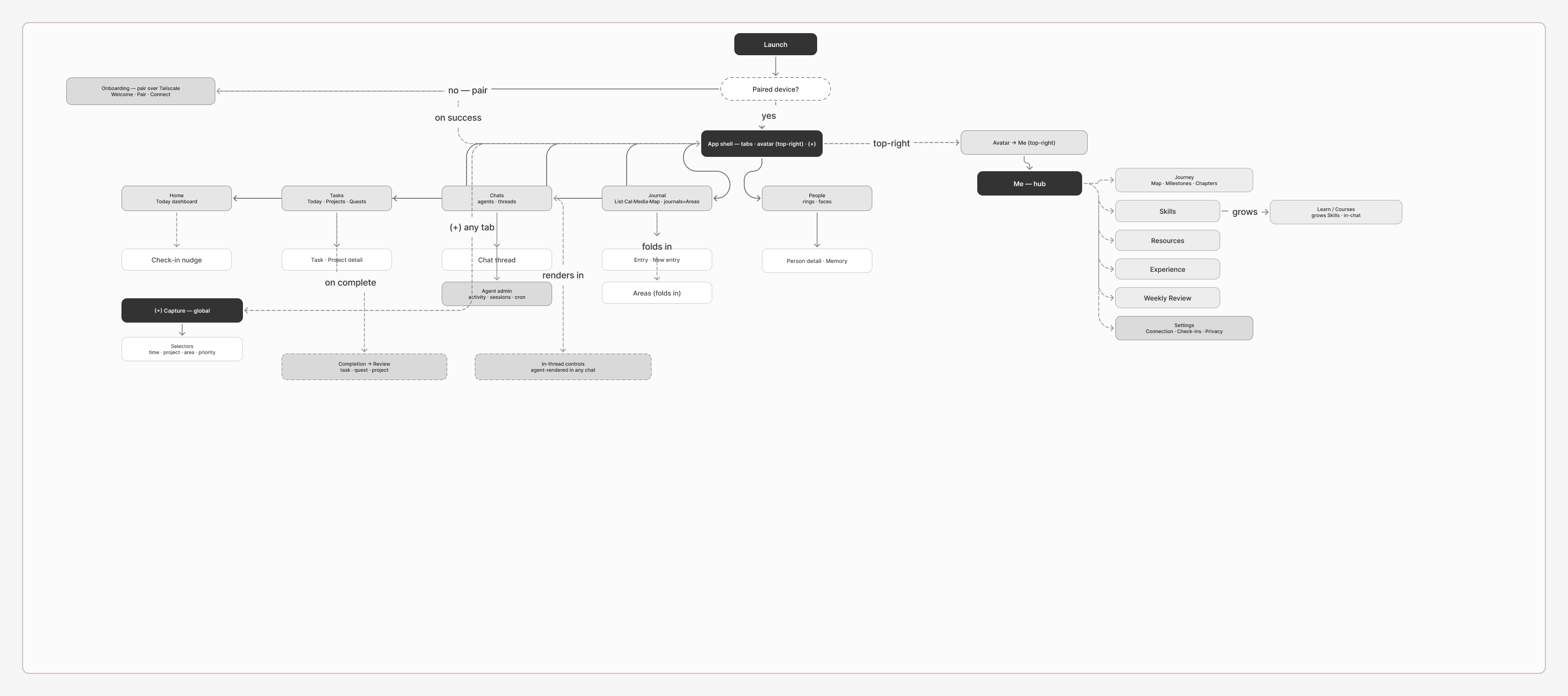
The original navigation map from FigJam. It describes the broader product concept, including areas still in exploration such as People, Learning, and agent administration. Explore the sitemap in Figma.
The wireframes explore the daily overview, task planning, quick capture, check-ins, journaling, and agent conversations. They show different iterations of the concept: the earlier Home navigation still includes Areas, while the later sitemap folds that structure into Journal.
Early wireframes
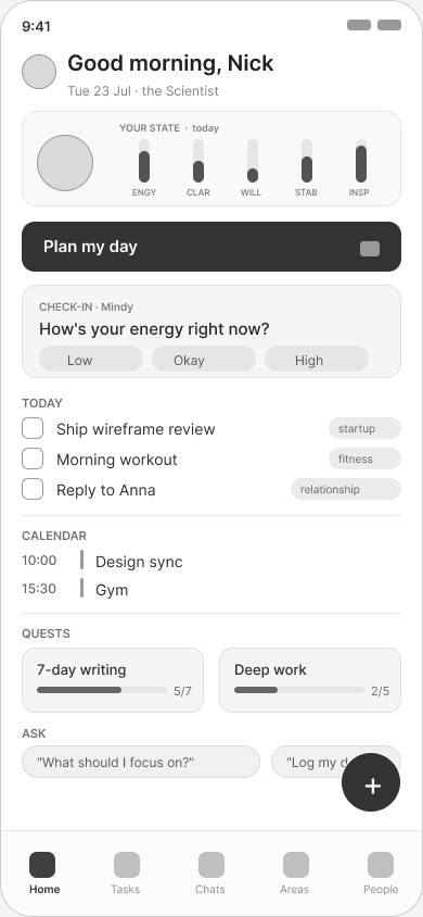
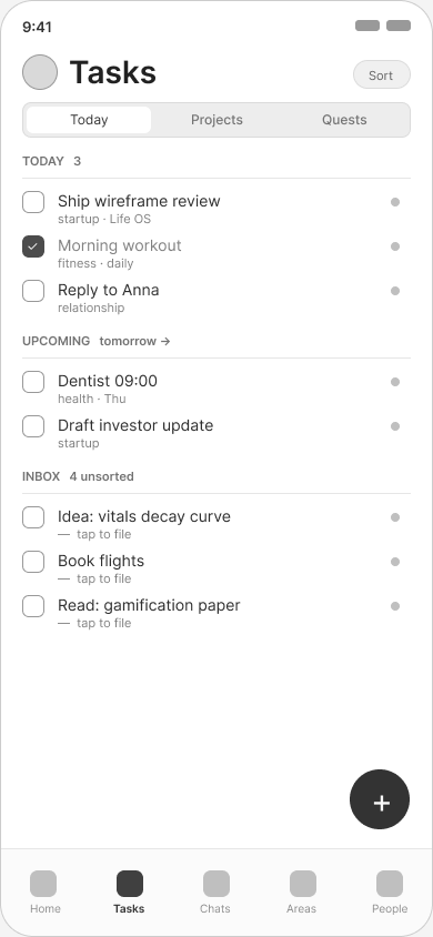
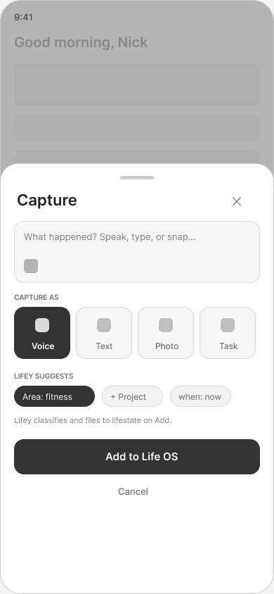
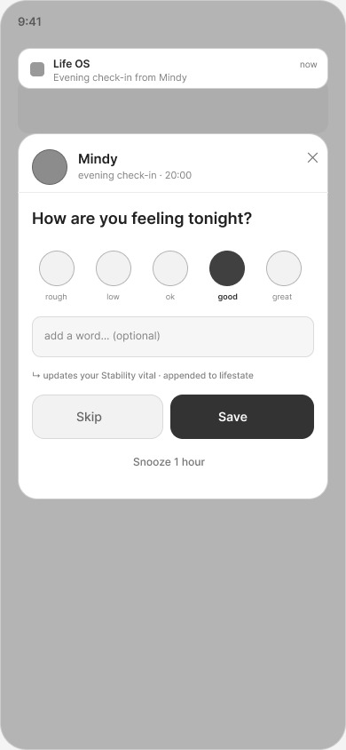
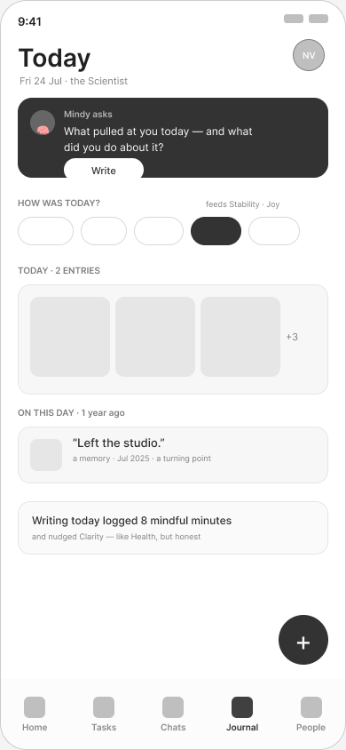
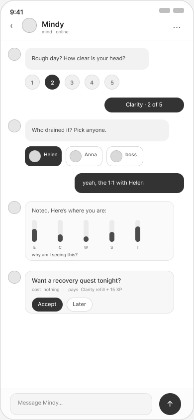
Original low-fidelity screens, before the Field Notebook visual language. The capture study asks an agent to classify an entry as part of adding it; implementation later moved task recording ahead of classification. Rich in-chat controls remain a design exploration. Select any screen to view it at full size. Explore all wireframes in Figma.
The full board goes well past the first loop. It covers entry and pairing, the five tabs, the game and model layer behind the avatar, detail screens and capture sheets, plus system screens and in-thread controls.
Wireframe board
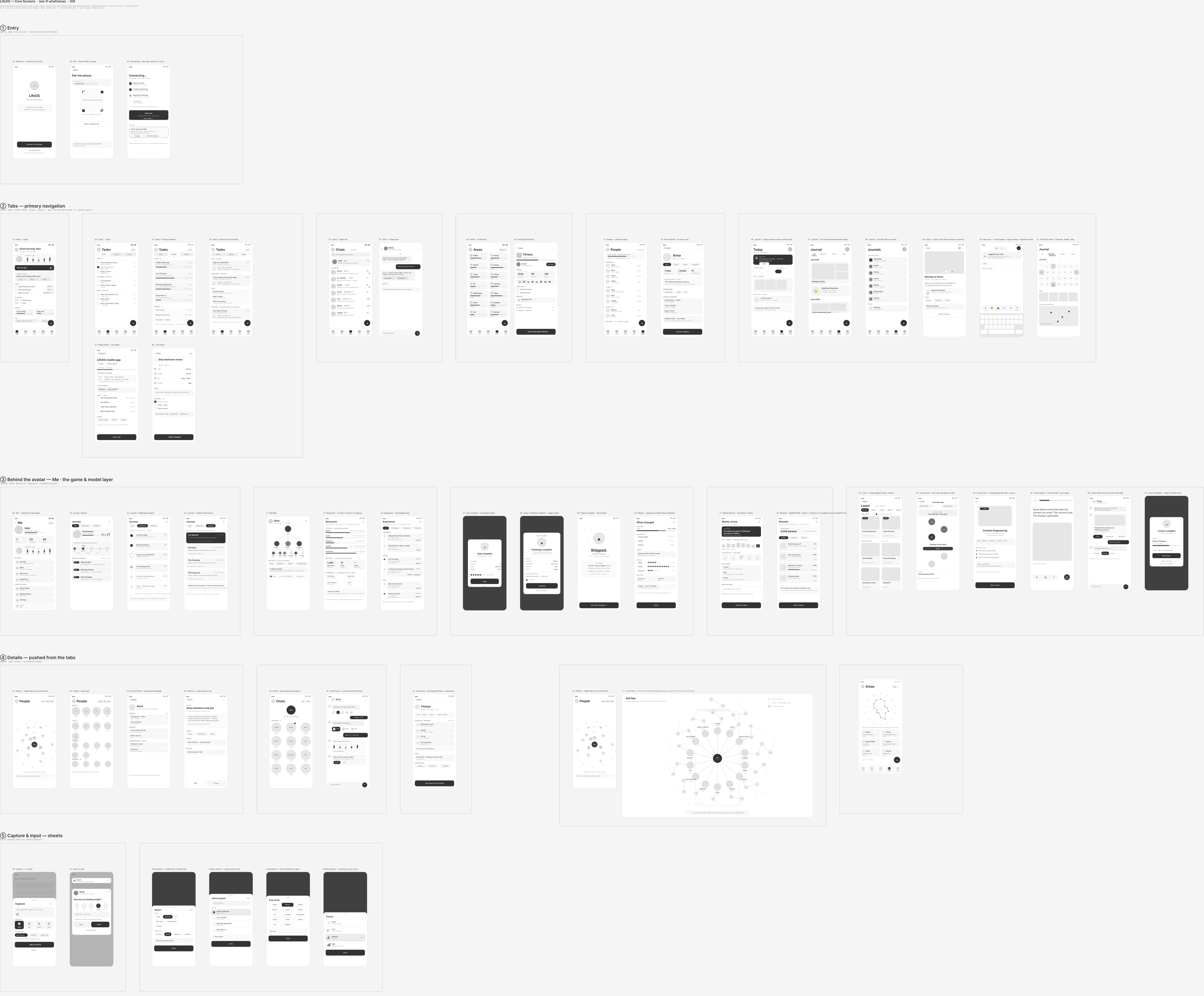
Sections one to five of the low-fidelity board, drawn under the second IA: five tabs, Me behind the avatar, and a floating add button. Explore the full board in Figma.
Focusing the implementation on a usable Tasks loop gave the architecture a concrete requirement. My Mac is the backend and sometimes sleeps. Recording a task on my phone should not depend on reaching it, or on waiting for an AI model to classify the task.
One service behind a native app
The app is divided into SwiftUI screens, application logic, typed clients, and a reusable design module. Feature clients share one server address and credentials. Records travel over REST; agent replies stream over a WebSocket.
Earlier versions split the app across an OpenClaw gateway and the LifeOS API, while a separate engine service sat outside the app’s path. I consolidated the app’s features into one FastAPI service. The system architecture keeps OpenClaw as a separate Telegram and automation surface.
iPhone
FastAPI on the Mac
Data + agent
The boundaries let me change a transport or test a screen with controlled data while retaining its interaction logic. I kept the system sized for one user and one personal backend.
Record the task before classifying it
The initial capture flow asked an agent to classify and file an entry as part of adding it. That put a model response and a network connection between a thought and its record.
Capture and input sheets
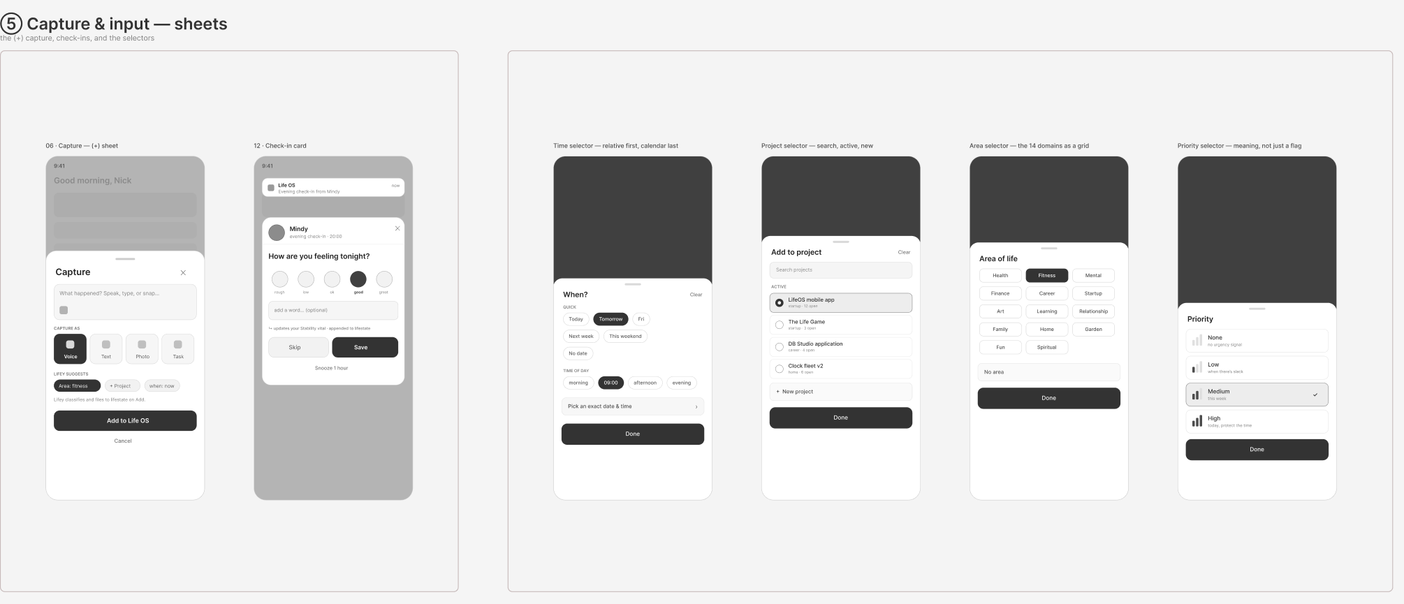
The original capture sheet, a check-in card, and selectors for time, project, area and priority. The implemented flow records the task before any classification.
The implemented Tasks flow inserts a local row and appends an event to an on-disk outbox. Synchronization happens afterward. The server returns accepted, duplicate, or quarantined event IDs. Each receipt settles the event; quarantined events are recorded without being applied. Retryable events remain queued; refused events are kept separately for review.
Show the row
Save to the outbox
Send pending events
Settle + reload
The phone keeps a small optimistic view of task state. The engine owns the full derivation, including which tasks belong in Today. This keeps the interface responsive without maintaining two complete versions of the domain logic.
Completion and undo use the same model: completing a task appends one event, and undo appends the opposite event. The record remains intact.
Tradeoff: the phone can show a change before the server has accepted it, so pending and failure states matter. This offline queue currently covers Tasks. Journal and project writes still wait for the Mac.
Turn visual rules into component behaviour
I developed the Field Notebook language around a particular moment: opening the app after a difficult week. Warm surfaces and restrained marks give the interface its character. Colour identifies a faculty or an available action; it does not grade someone’s condition.
Native iOS prototype
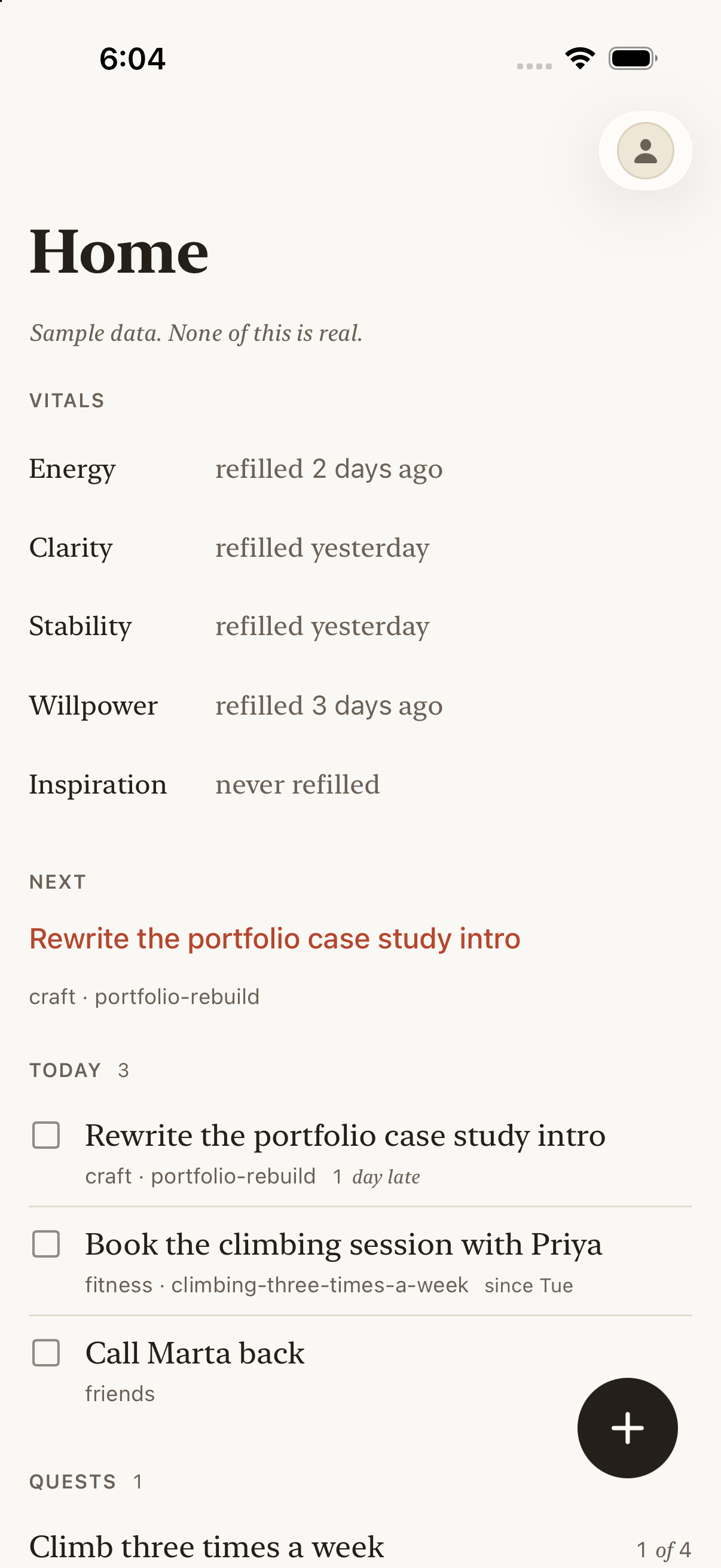
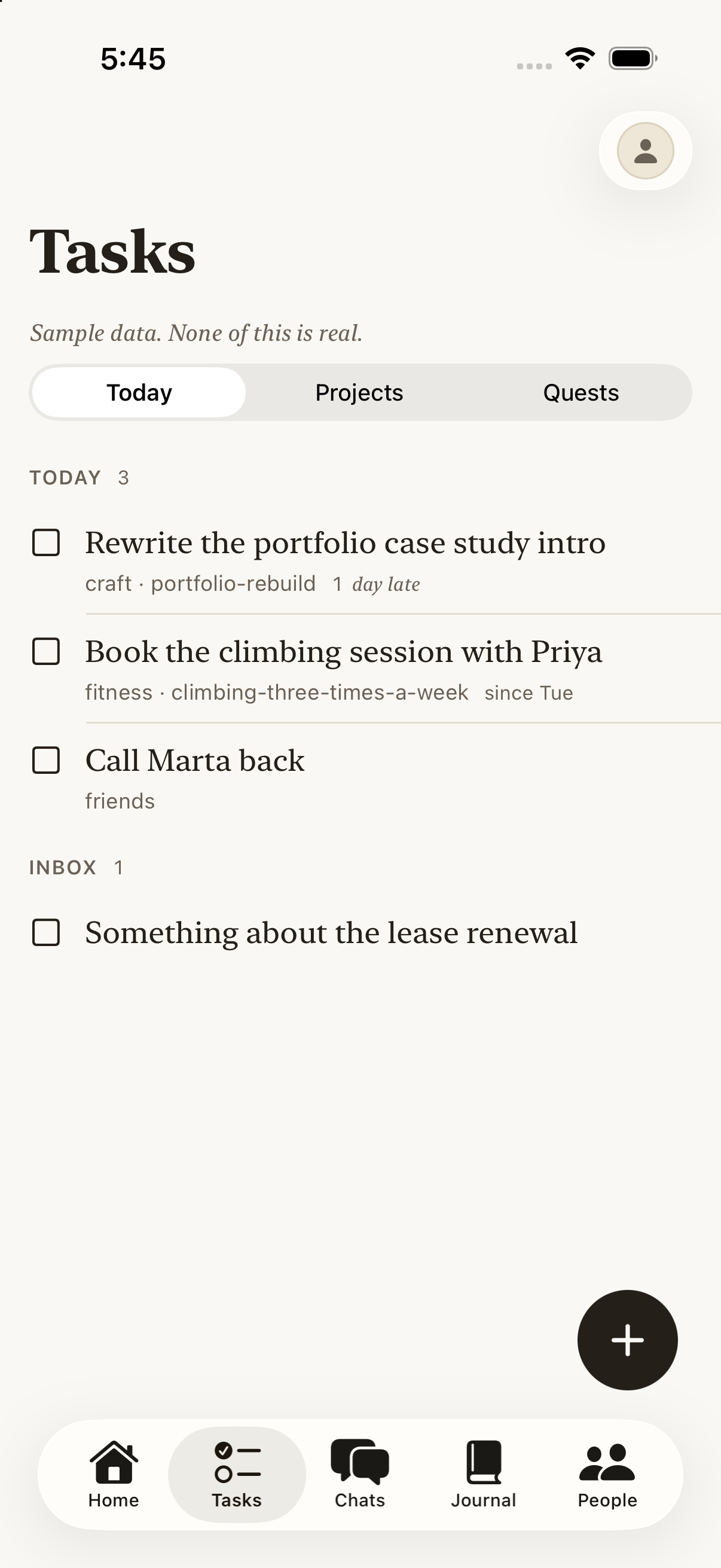
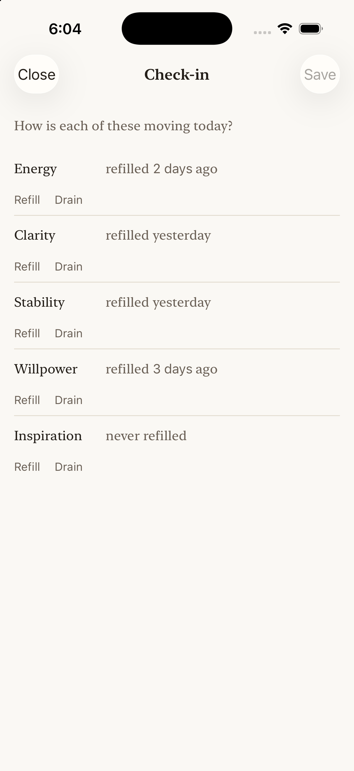
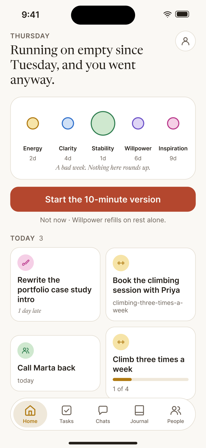
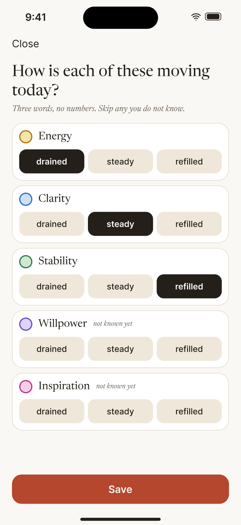
Home, Tasks, and Check-in in the native iOS prototype, using sample data. The Figma study at the top explores the presentation; this is the current implementation.
I implemented that language in a separate Swift module, LifeOSDesign. It owns typography roles, palette tokens, reusable components, and motion helpers, without depending on the app’s networking or business logic.
Light and dark appearance
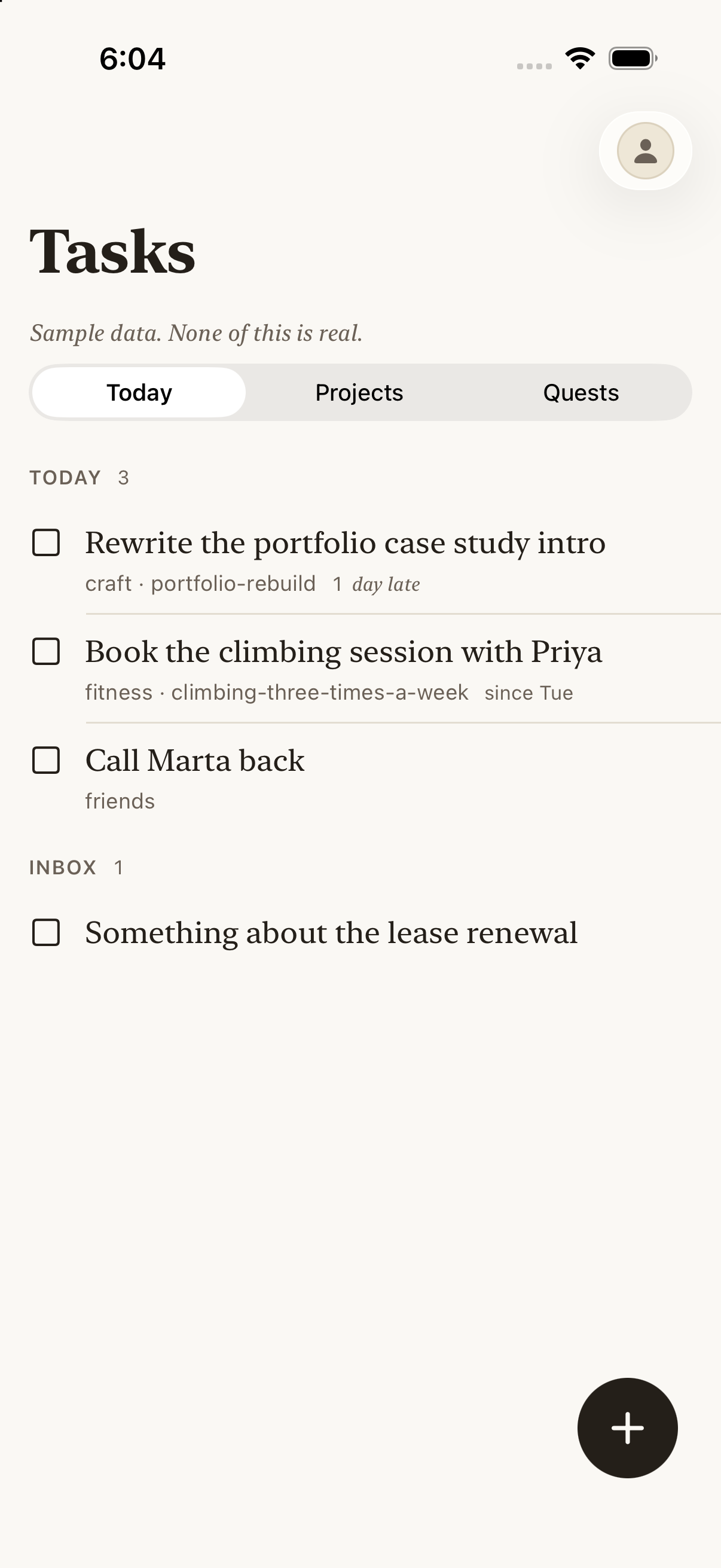
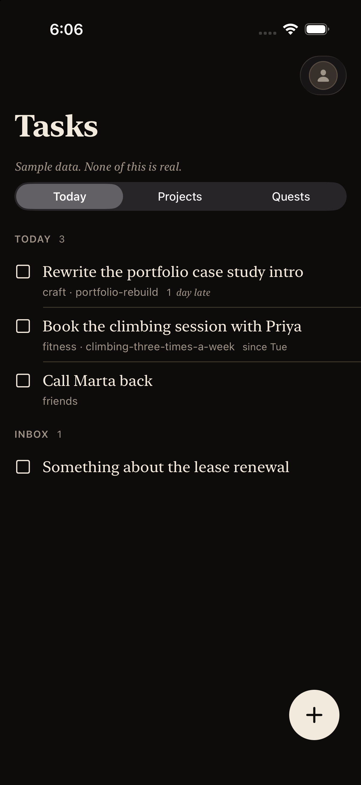
The same sample tasks rendered in the app’s light and dark appearances.
A screen expresses the role of a control through its API. For example, a primary handhold marks the screen’s main action, while the selected palette determines its treatment. Shared motion helpers choose timings by purpose and read the system’s Reduce Motion preference.
Task row states
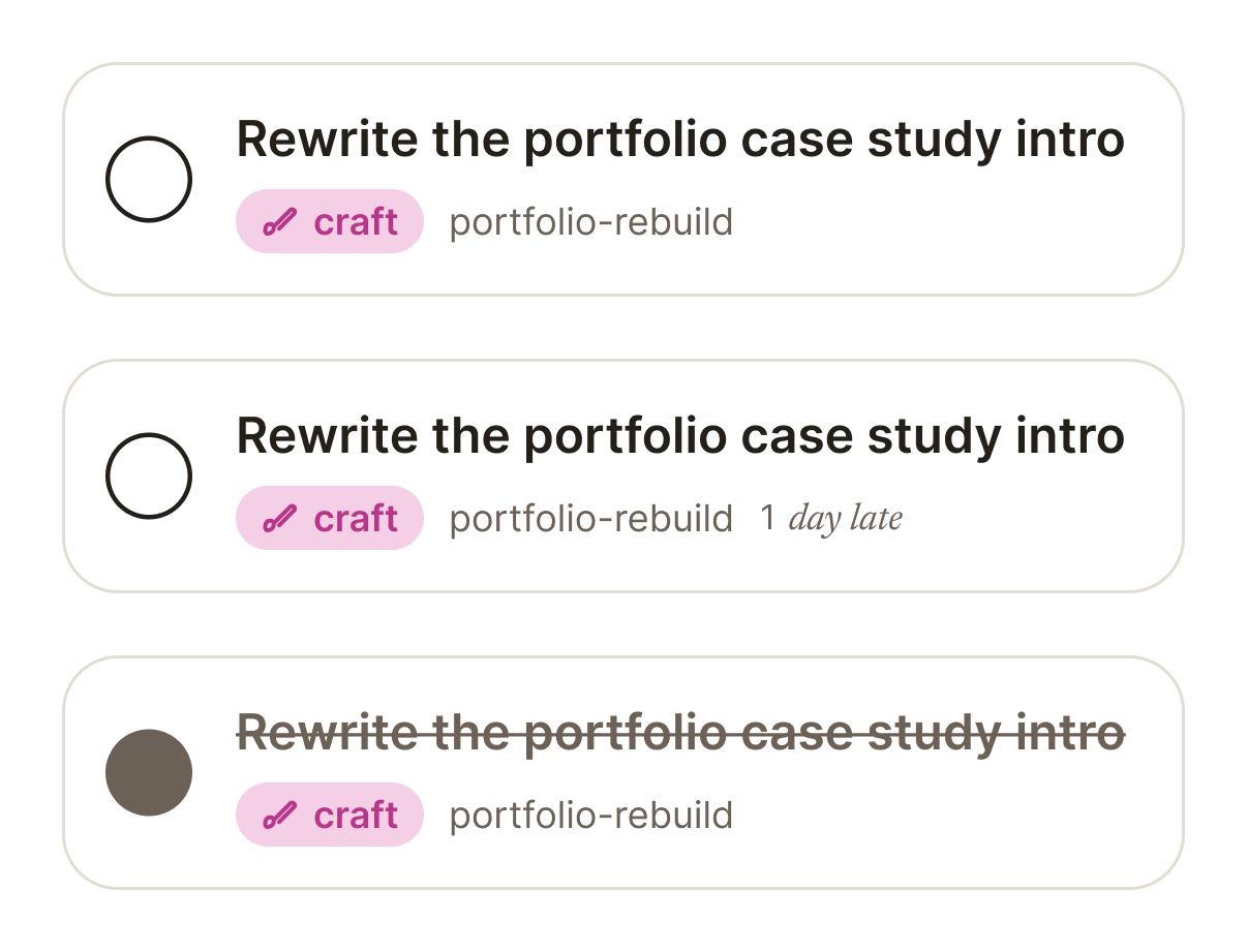
Default, overdue, and completed task-row variants in the Figma library.
The motion resolver makes that preference part of the shared implementation:
static func resolved(
    _ animation: Animation,
    reduceMotion: Bool
) -> Animation? {
    reduceMotion ? nil : animation
}
Views using the motion helper receive its accessibility behaviour; direct animation calls require separate review.
Tradeoff: the system adds constraints to screen composition. I kept utility flows native and concentrated custom work in the visual language and the components that carry it. The repository includes token checks, style rules, tests, and a rendered screen audit, alongside visual review.
Make the rules hold on real screens
A rule stated only in prose erodes as screens accumulate. Where I could, I put the rule in the design module’s API instead.
Design module API
Palette tests
Style gate
Screen audit
Design review
The accent colour is not public. Outside the module, the only way to put it on screen is the handhold button style, so any accent a person sees marks something they can tap to move forward. Vital colours are requested by name and can’t be computed from a reading, so a low reading is a short line in its usual hue.
Reading a week
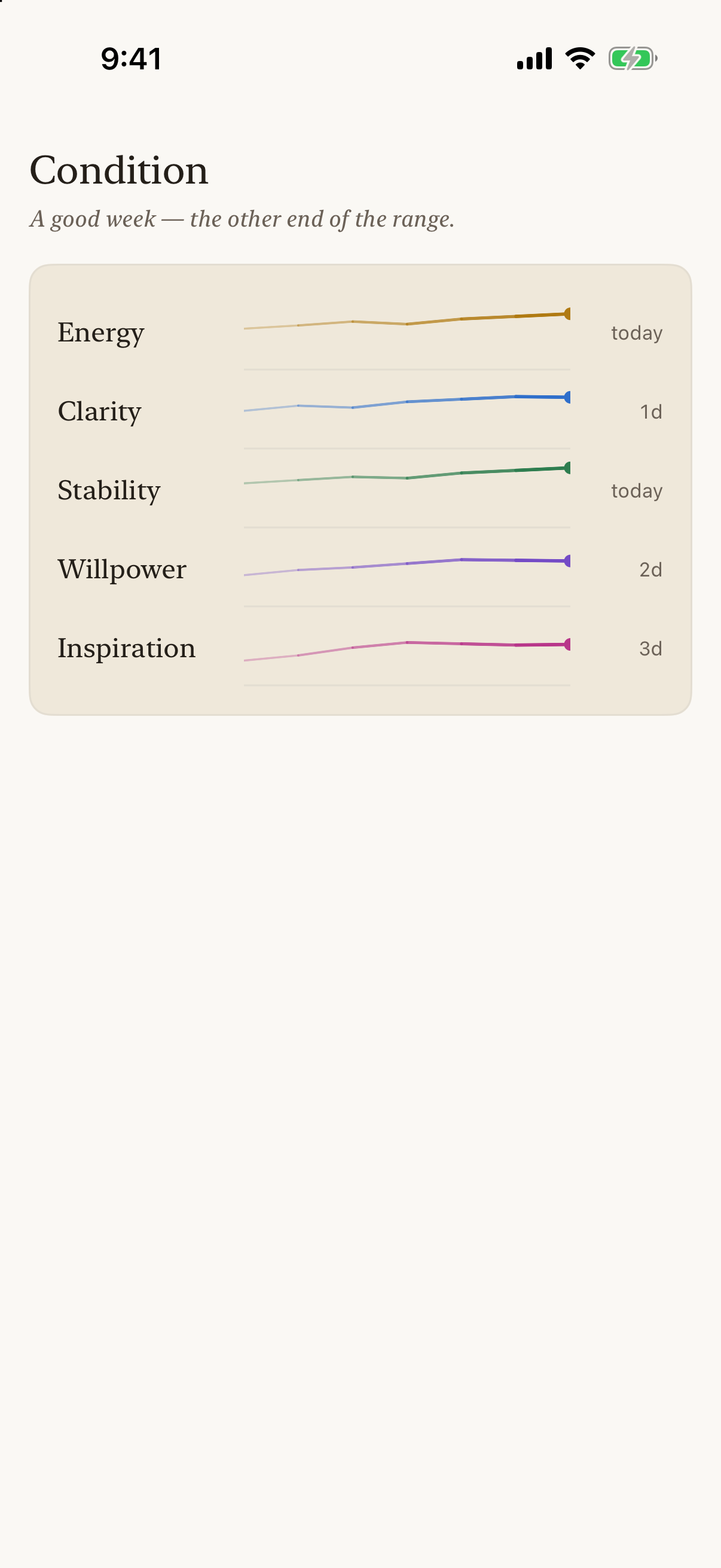
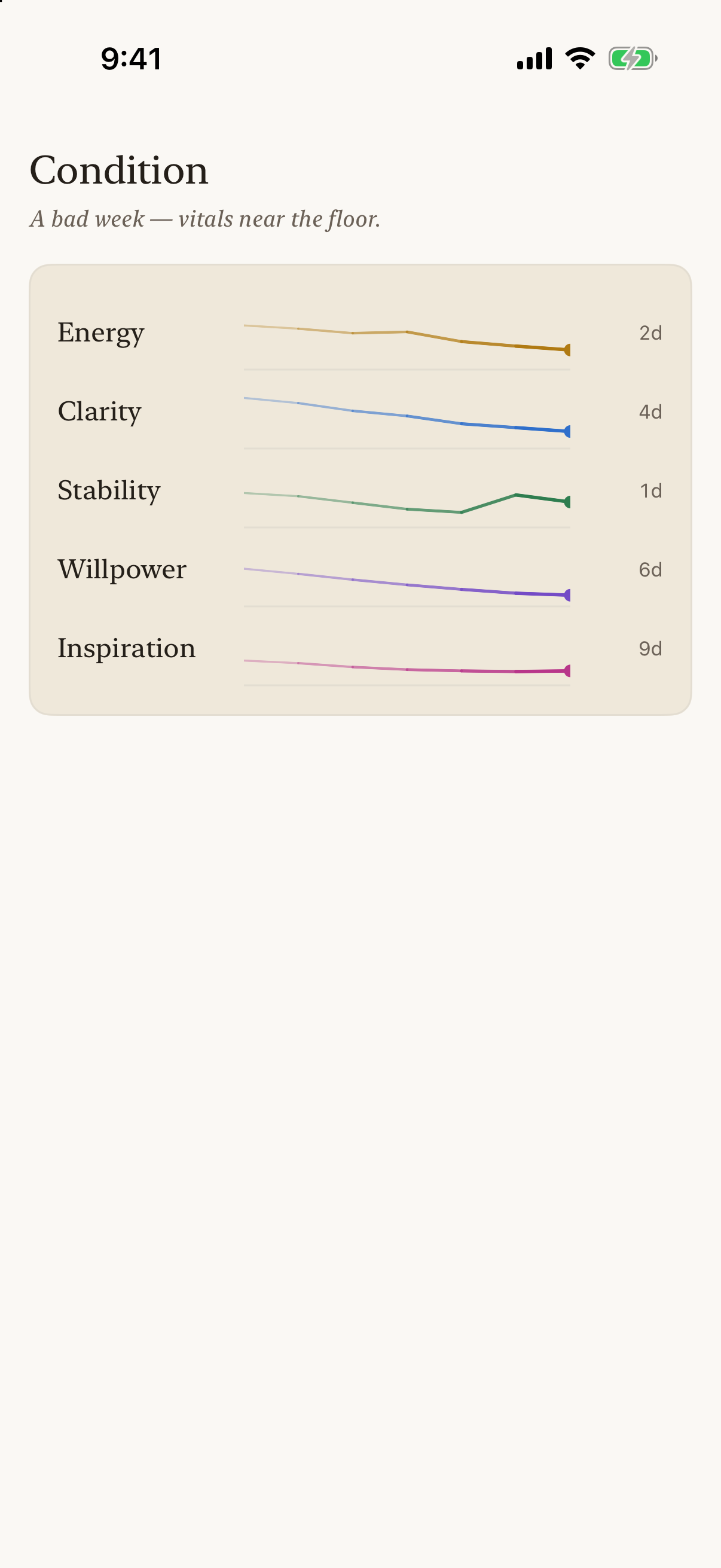
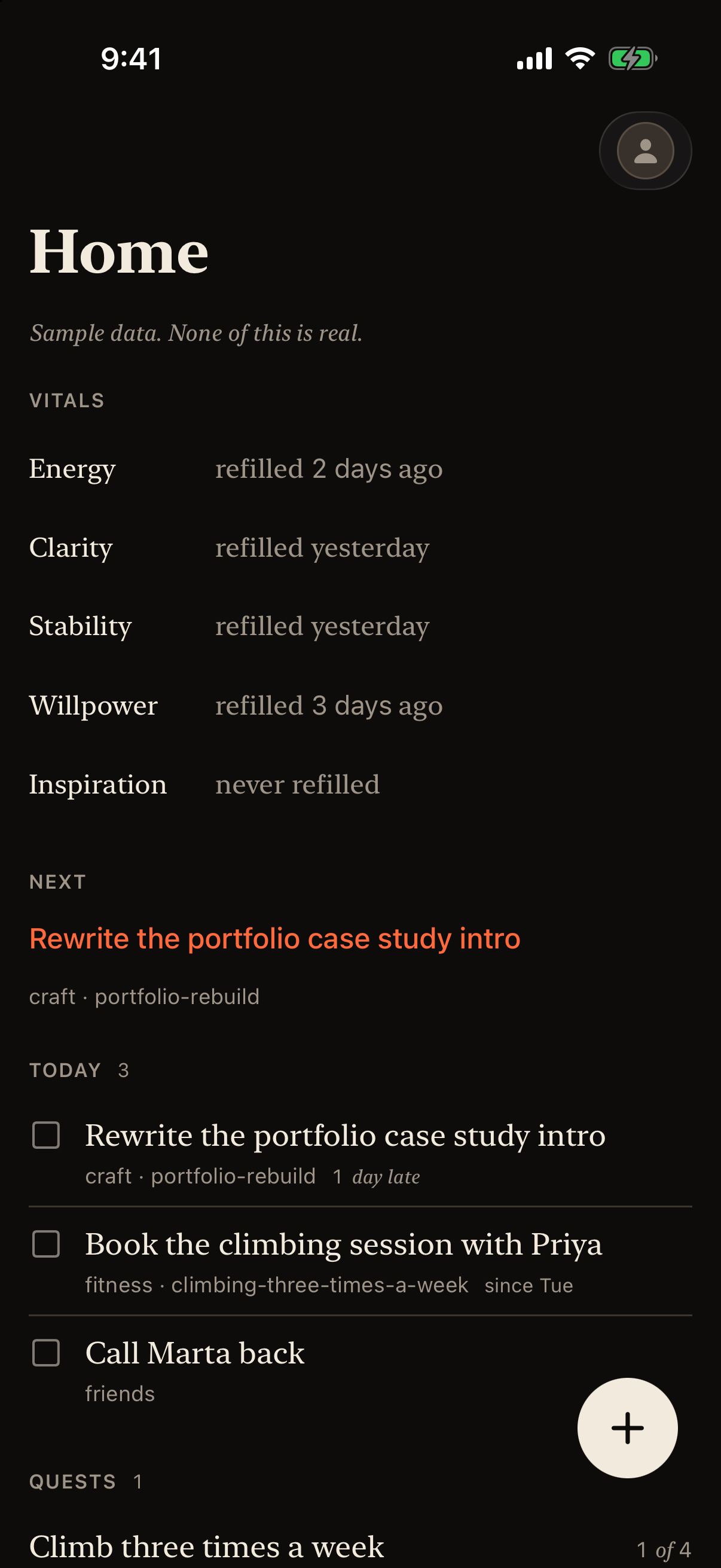
The vitals on a sample good week and bad week, and Home in the dark appearance. The hues stay the same, while length and elapsed time carry the reading. The only accent on Home is the next action.
Contrast is a unit test, and the app’s design gallery shows each colour’s measured ratio in both appearances. Token tests still can’t see composition: what happens when legal colours meet on a real screen, at every text size.
Design gallery
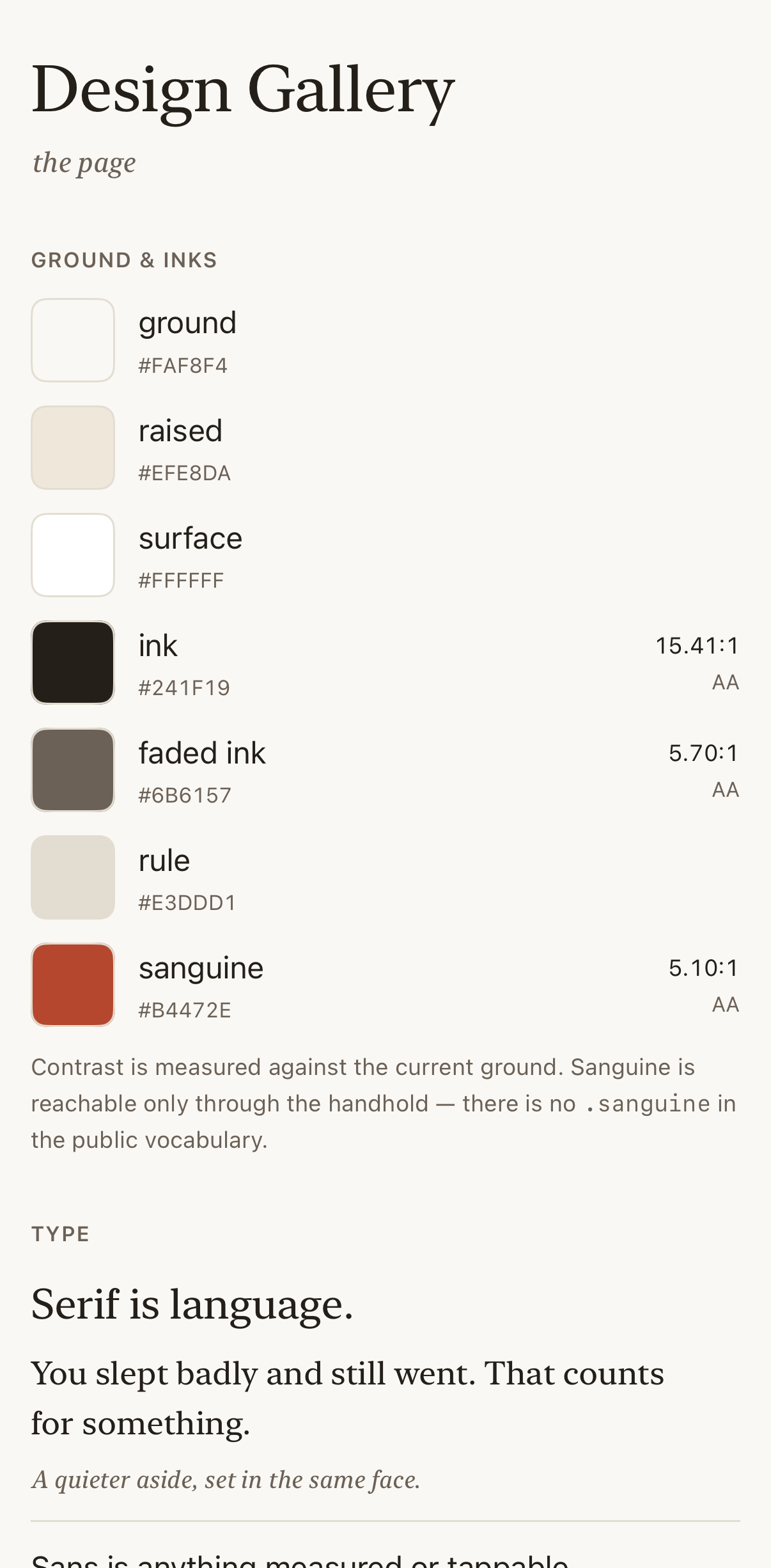
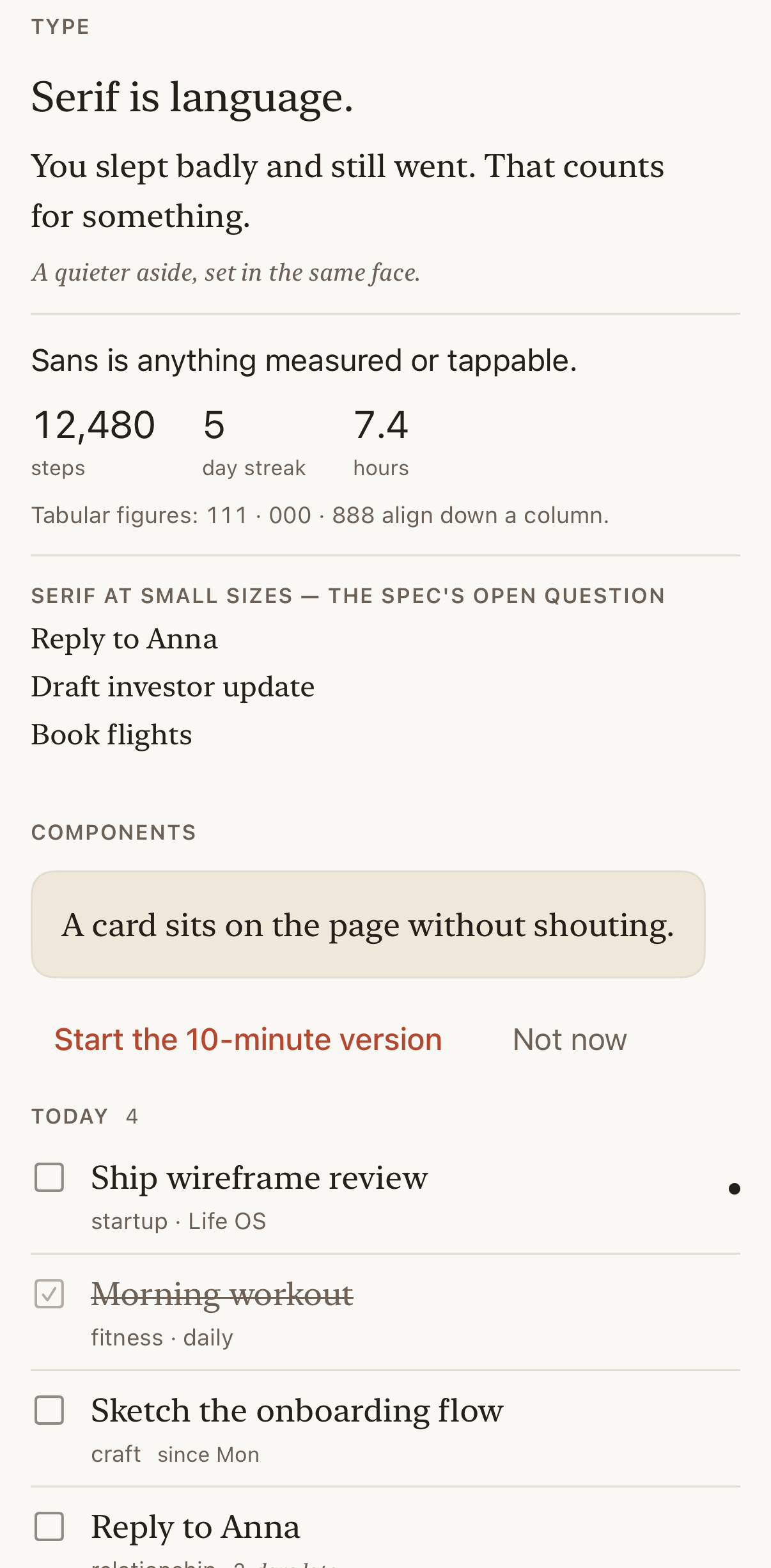
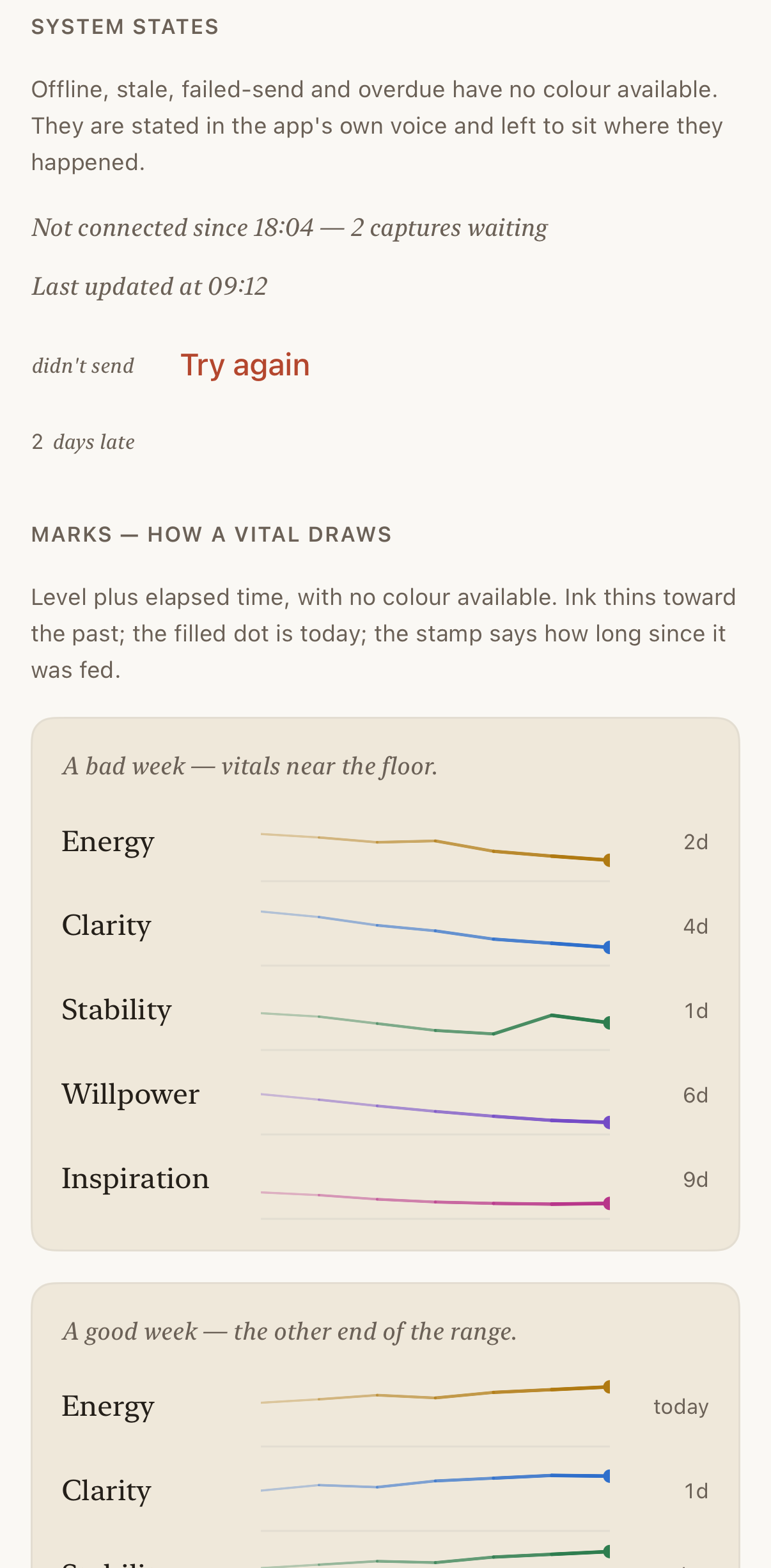
The design gallery is a route inside the app. It measures each colour’s contrast against the current ground when it renders, and states the type and system-state rules beside live examples.
A throwaway spike tested that gap by running the system accessibility audit over five preview routes. It found contrast failures while the palette tests were green, and vitals labels breaking apart at accessibility text sizes. I had chosen that component by comparing three candidates, at one text size.
One component, two text sizes
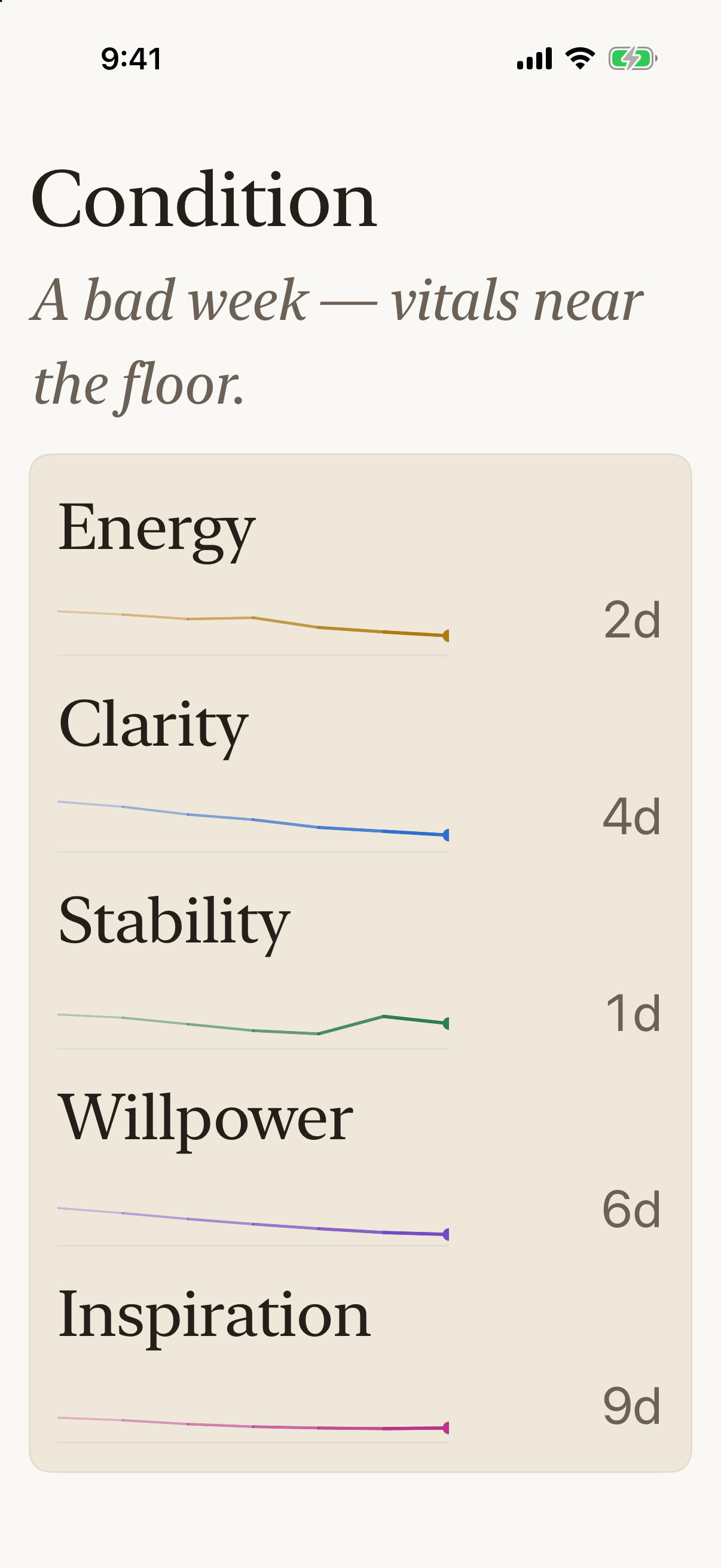
The vitals marks at the default text size and at accessibility extra large, where each label moves above its line. This is the component the spike caught.
The spike became a screen audit that renders every preview route in light and dark, at the default and an accessibility text size. Its first full run reported 243 findings. I grouped them by root cause, fixed twelve causes, and recorded a written reason for each group I excluded. Open findings reached zero.
That run also corrected my diagnosis. The spike blamed secondary text on a raised card, a pairing that measures 4.96:1. The real failure was accent text on a raised card, at 4.44:1, a pairing no palette test covered. I moved the button onto the page ground, where every shipped use already sat, and left the colour alone.
Tradeoff: the audit has no opinion about taste. A number set in the wrong typeface, two accents on one screen, or an accessible but awkward layout all pass. Those stay with design review.
Make the real screens available without the backend
I needed to explore the interface while its services and domain model were still evolving. I added a demo path that substitutes controlled inputs beneath the app’s existing clients and screens.
A sample life provides tasks, projects, journal entries, and vitals through a fixture HTTP implementation. A fixture socket returns a canned chat response when a message is sent. The app uses the same view models and rendering path.
Same screens, same logic
FastAPI on the Mac
Fixtures over one sample life
Controlled prototyping
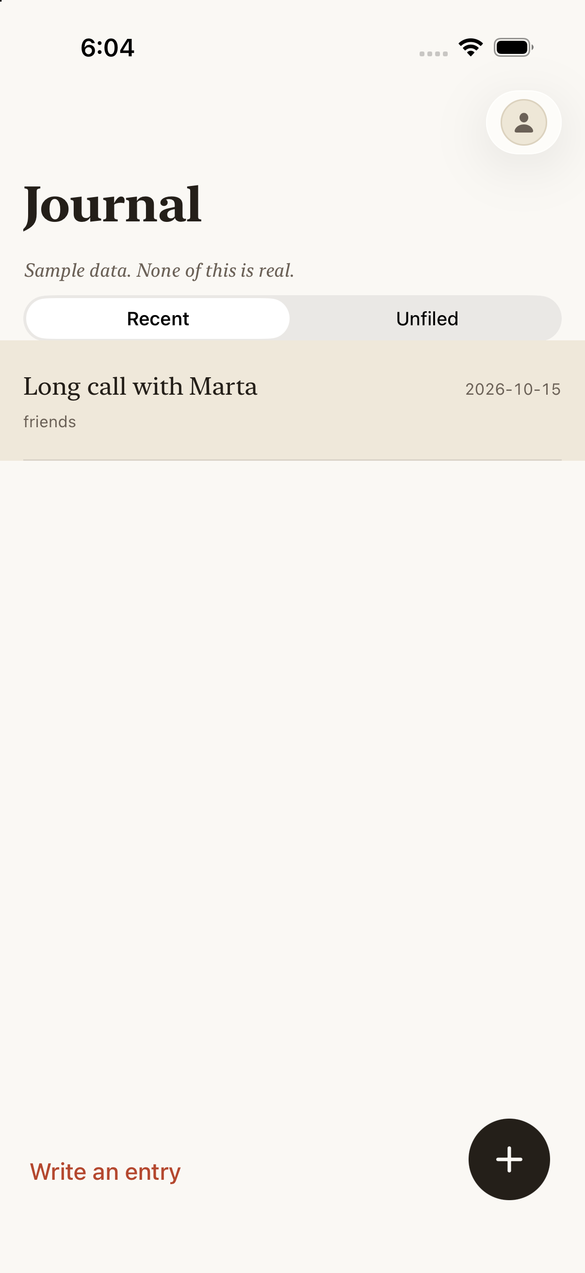
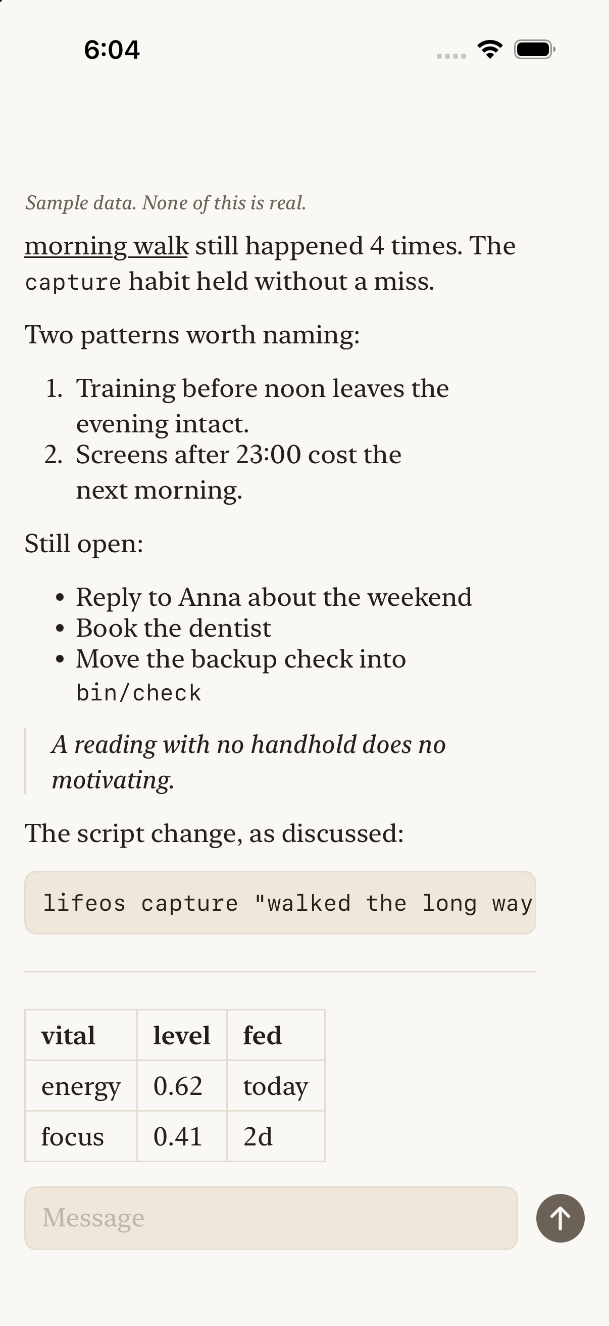
Native Journal and thread views rendered with fixtures. The thread is a rich-text specimen; its text and numeric values are illustrative.
Demo chat history uses an in-memory store, and demo task events go into a separate temporary outbox. Demonstration content therefore stays outside the normal chat store and task queue.
This gives me a repeatable setup for comparing screen treatments and reviewing interactions without needing the Mac service or a model response on every run.
Tradeoff: the fixtures serve a fixed sample and acknowledge writes; they are not a fully mutable backend. Live synchronization and model behaviour need their own verification. The demo is useful precisely because its inputs and limits are explicit.
Designing through implementation
Figma holds the product model, navigation maps, wireframes, and interaction states. Code exposes the consequences of those designs: what happens while the Mac is unavailable, where a draft survives, how a task settles after synchronization, and which behaviour belongs in a reusable component.
Interaction states overview
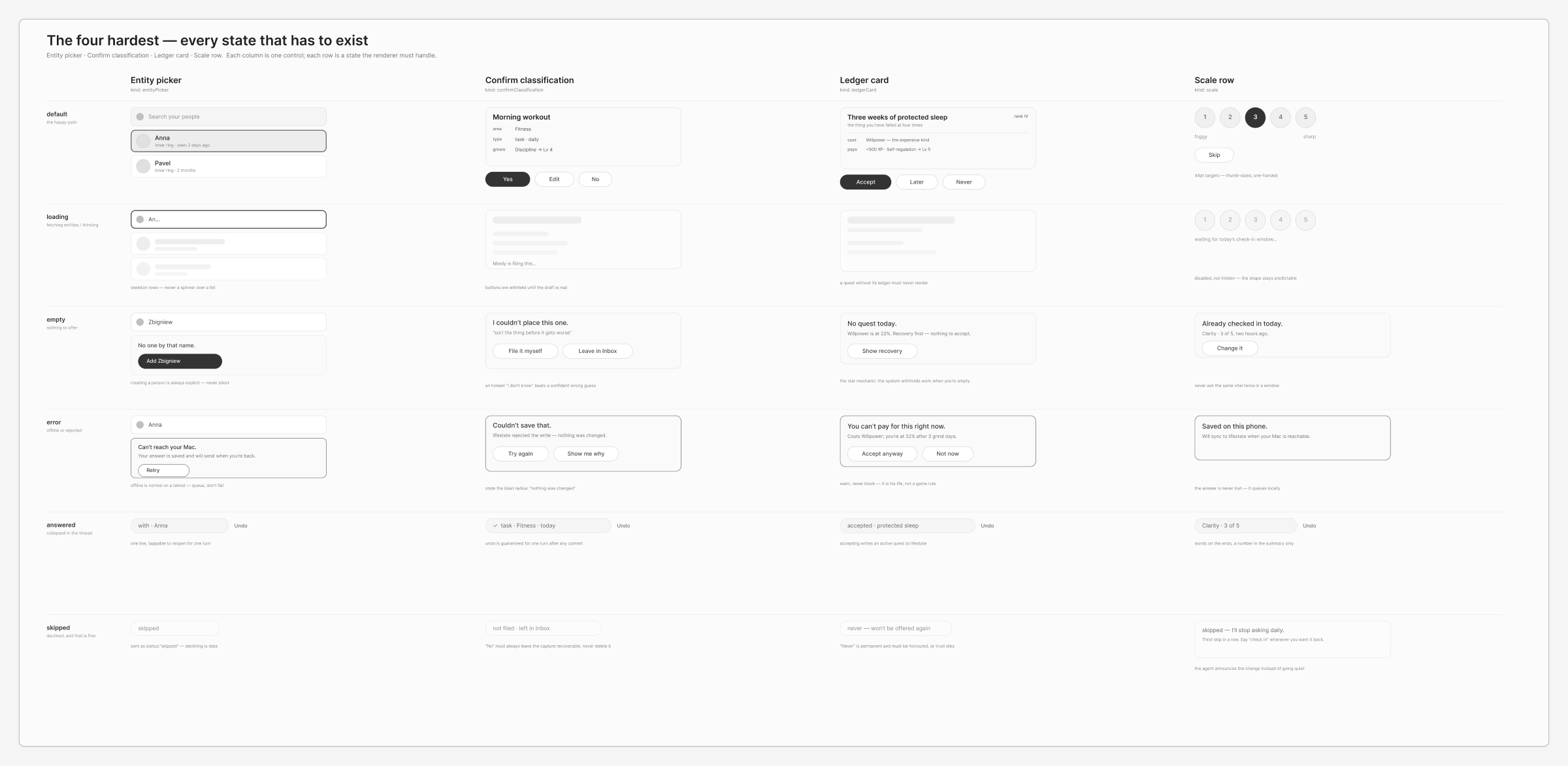
Interaction specification for agent-rendered controls: default, loading, empty, error, answered, and skipped states. This richer control vocabulary remains proposed. Open the full state board.
Figma and code share one ledger. Each component in the Figma library has a row naming the Swift type it mirrors and its status. A test fails when a row names a type the code doesn’t declare, or still lists as proposed a type the code already has. The Figma side is checked by hand.
Figma library
Mirror ledger
LifeOSDesign
Disagreements stay visible. Figma draws the add button in the accent; the code keeps it in ink, because a control that never leaves the screen would put the accent on every screen. The ledger marks that row as diverged, and the decision stays open until I review it in context.
Where Figma and code disagree
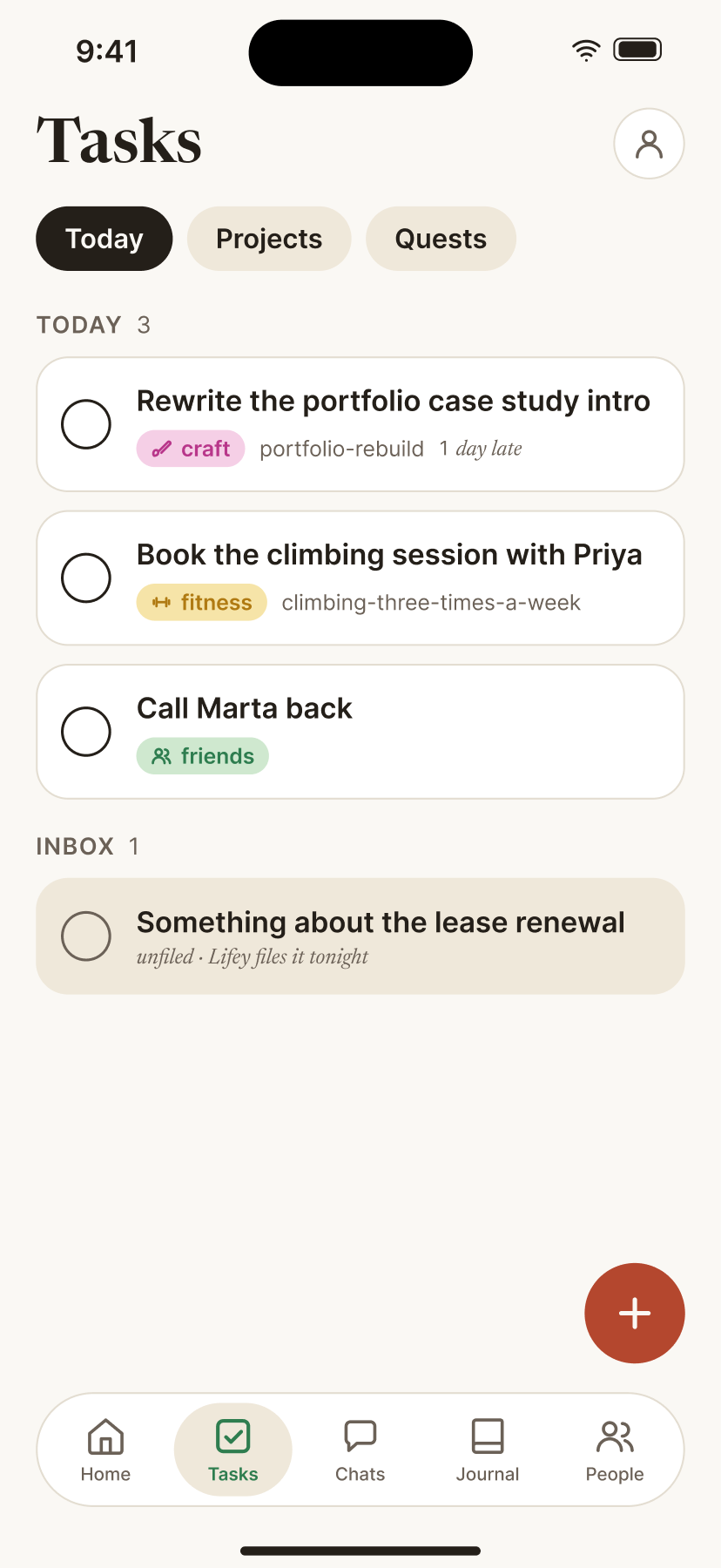
The same Tasks screen in the Figma study and in the native app. The add button is the ledger’s one diverged row.
I use AI coding tools to help implement the system. My role includes defining the experience and constraints, choosing architecture boundaries, reviewing proposed changes, and deciding what belongs in the product.
One deliberate boundary remains in the vitals engine. It can report observations and elapsed time, but it leaves inferred levels unknown until there is a rule worth trusting. The interface has to represent that absence honestly. Building the surrounding pipeline does not require inventing an energy score.
Current state and next questions
The implementation includes task capture and completion, journal flows, project browsing and state updates, check-ins, streamed agent chat, a reusable native design module, and a controlled demo environment.
The broader vision is still evolving. The People store exists while its app tab remains a placeholder. The richer agent-rendered control vocabulary is specified in Figma. The full vitals inference and reward economy remain future work.
The work demonstrates how I connect interaction decisions to component APIs, application state, persistence, and service boundaries. The next test is sustained everyday use: which parts reduce effort, where the system becomes maintenance, and which ideas deserve to survive.
Image provenance: native screens were captured on October 16 from the installed October 12 build; its exact source revision is unverified. Preview routes use sample data and omit the full app navigation. Figma images are labelled as design studies or specifications. Life Atlas was captured from its public demo.